Sunshine Crepe Branding
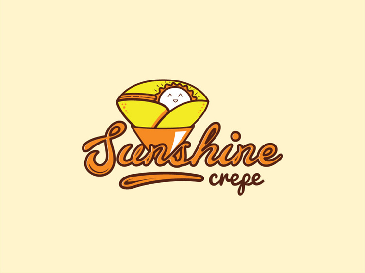
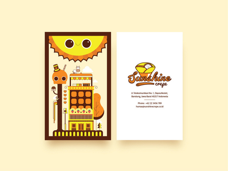
This is my old project to make a visual branding for a new food SMEs named, Sunshine Crepe. The client want the logo looks happy, like a sunshine. A happy girl in the morning. I take it as a keyword, so it could be a sun, and it looks happy, energetic, and sweet like a girl.
From that, I create this logo. I combine the shape of sun and crepe (and of course a happy face) for that. If you realize, this logo is inspired by our childhood drawing. Remember, two mountains with a sun in the middle and the road that passes through a field? I want to bring this memory, a moment when everyone enjoys their life as a child, a great moment of happiness.
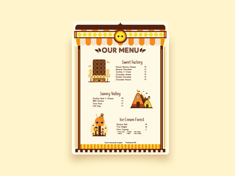
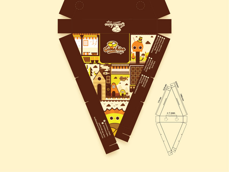
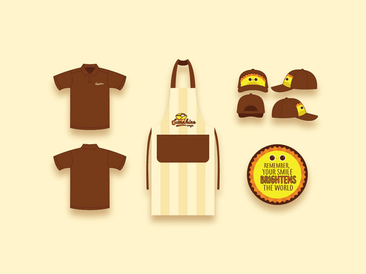
The design also delivered with other design elements, such as crepe packaging, menu, outlet uniform and card name.