Redesign of Hop'Hotel and rebranding

The process
I started this project in 2022, when I was starting to learn about UX design. The error I made was to design a traveling website as I wanted it to be instead of thinking how users would want it to be. In 2024, I decided it was time to do a proper use case and follow a UX process. The objective of this use case is to ease the travel booking process. To do so, I organized this use case into several steps :
Research and analysis :
Interviews with users
Competitor analysis
Creation of personas
Creation of user scenarios
Problem definition
Synthesis of collected data to identify key issues and formulation of a user-centered problem statement
Low-fidelity wireframing
Creation of low fidelity wireframes and iterations based on users feedbacks (after user testing)
Visual design and prototypes
Applying design principles to create visually appealing interface
Creation of a color palette, typography, and graphic elements
Transforming wireframes into interactive prototypes
User testing
User testing with prototypes to gather feedbacks
Here is a glimpse of what the project used to look like :
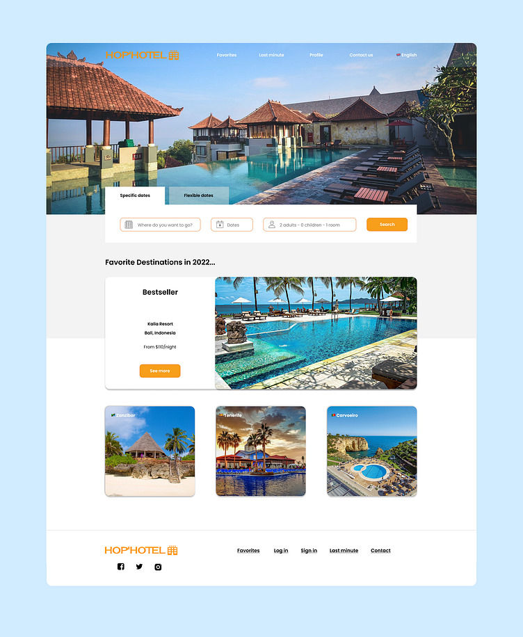
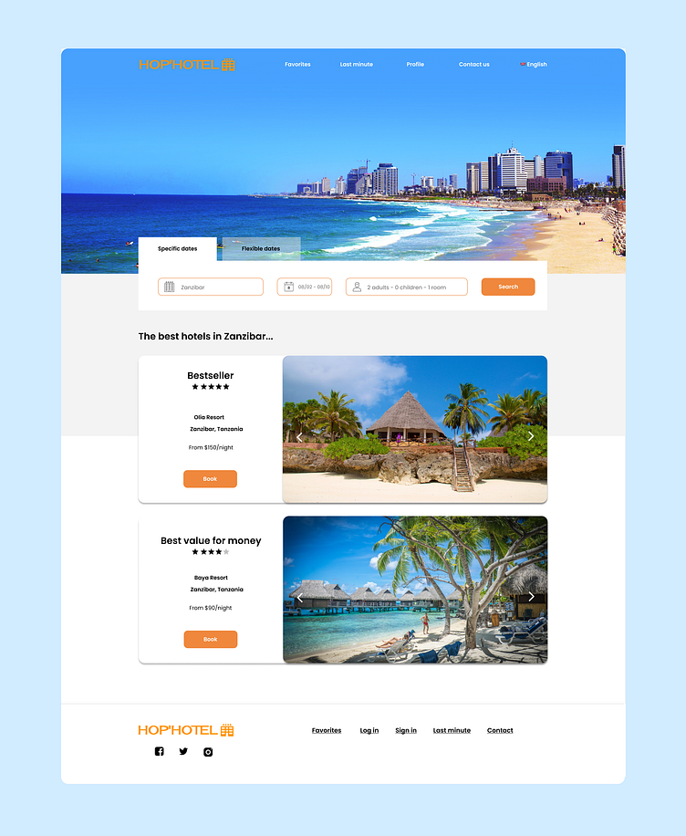
As said above, this design definitely lacks user research. Moreover, it didn't fit my plans for the project anymore. I wanted to start it all over again, including a rebranding to make it wider. Indeed, the name "Hop' Hotel" seems a little reducible and let people think -fairly- that it is only possible to book hotels. My plans for the project were in fact to book any kind of properties so this is why it was essential to restart from the beginning.
Research and analysis
I created an interview guide in order to gather relevant data about users' needs during interviews and make sure no important topic was put aside. After collecting the users' interview results, I was able to create user personas to help me during the wireframing phase as well as user scenarios. Moreover, I conducted a competitor analysis to identify the best practices and market gaps.
Problem definition
Once the research and analysis phase were over, I had a large amount of data that helped me identify the key issues users were facing. I was then able to define the problem: users were having difficulties finding accurate and complete information on destinations, accommodations and activities. They want access to detailed information about different aspects of their trip, in order to make informed decisions. They are also interested in features such as price comparison, online booking, reviews and comments from other users, sharing photos and videos, searching by specific criteria, etc. They need offers that are tailored to their needs and interests in terms of travel category (family, adventure, leasure, business).
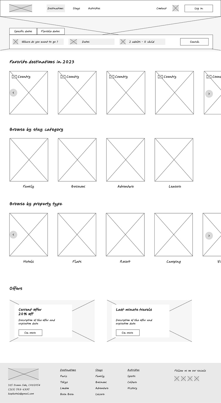
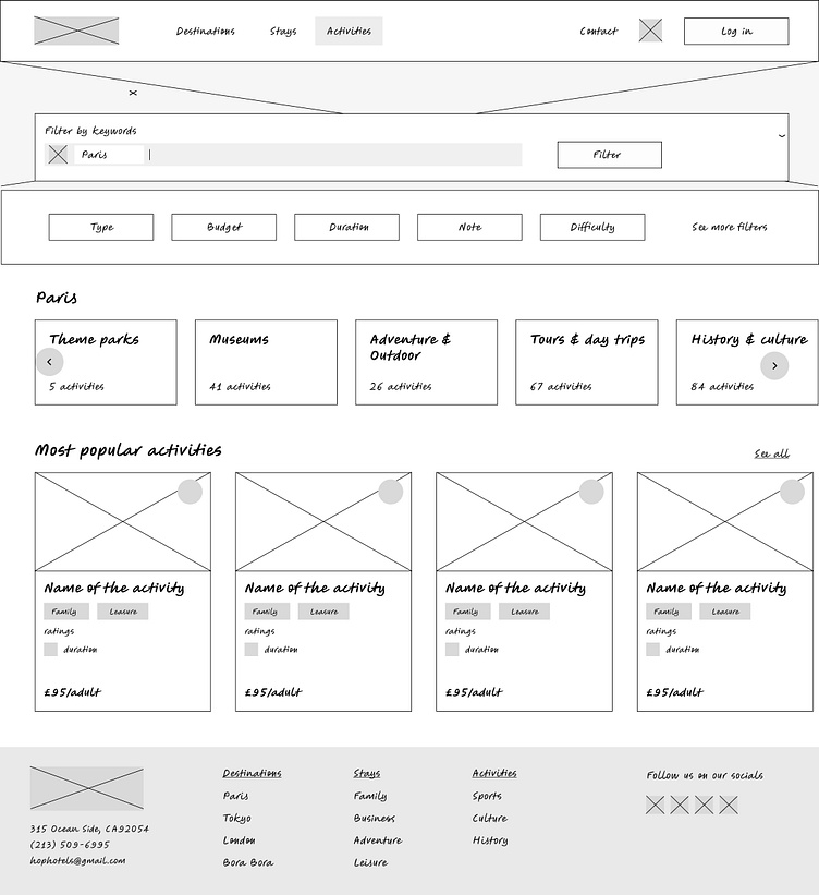
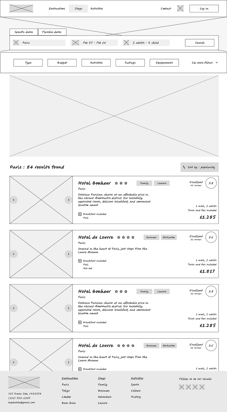
Low-fidelity wireframing
After the research phase, I started designing low-fidelity wireframes to have a better idea of what the interface would look like.
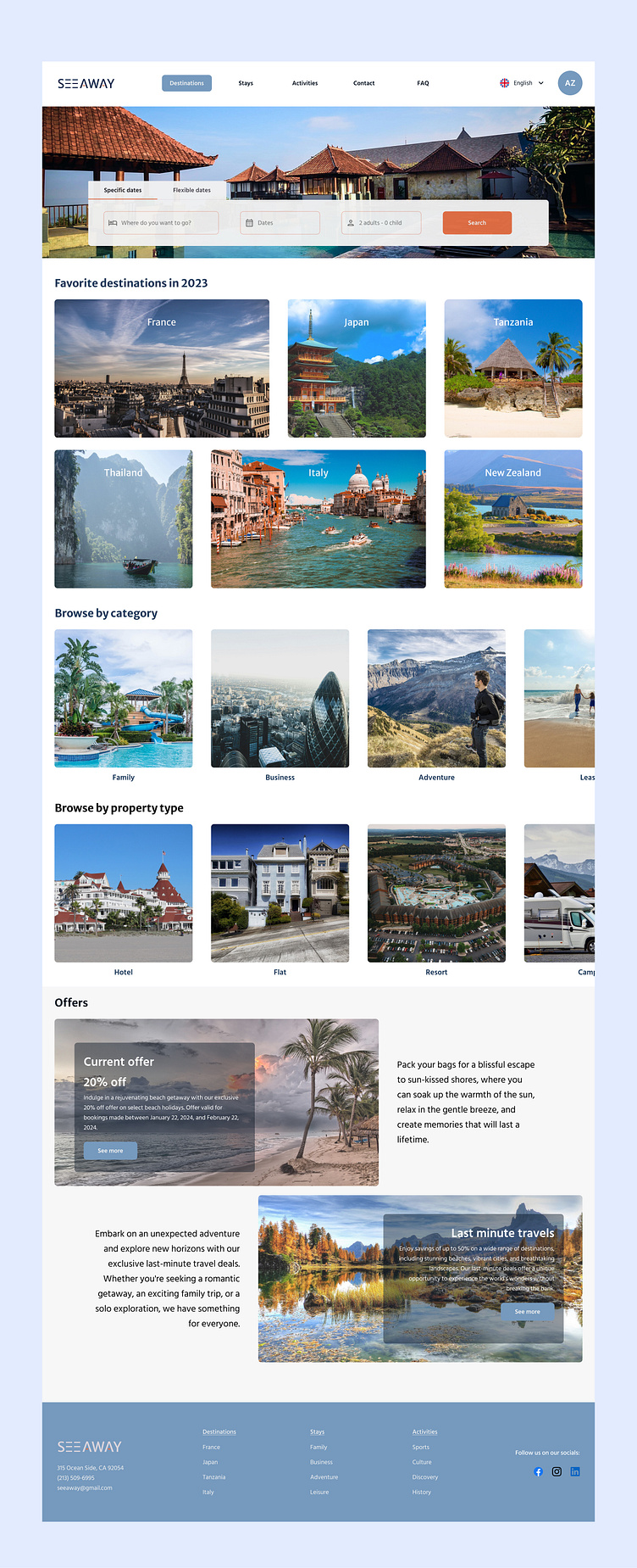
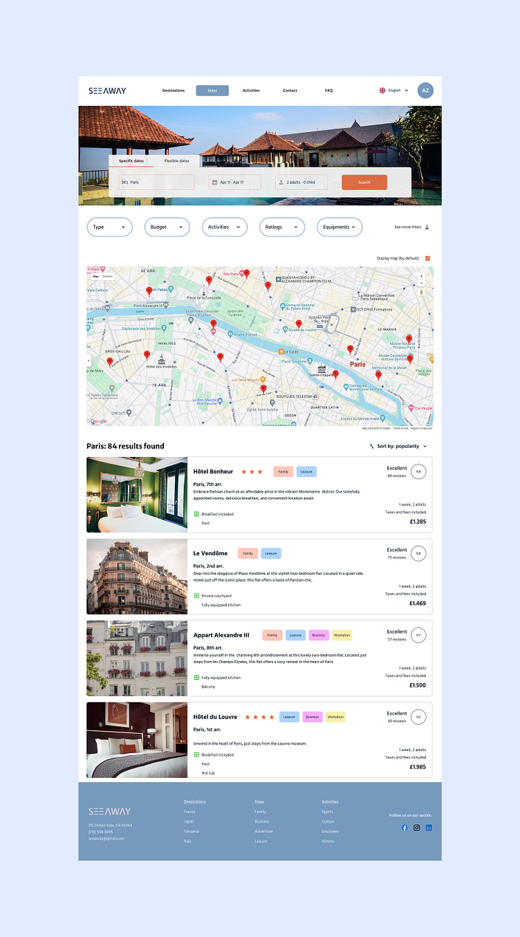
Visual design and mockups
After the wireframing phase and a user testing session, I started the visual design and mockups phase. During this step, I created the logo, choose the typography, the color palette and started creating all of my components and variables (on Figma). This is the result so far :