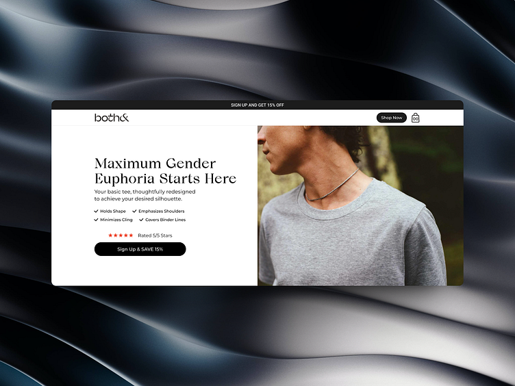
Both& - Landing page
Overview
Both& is a modern clothing brand that specializes in creating clothes for gender-neutral individuals. The client wanted a landing page that effectively promotes their inclusive clothing line, showcases their modern approach, and increases the conversion rate (CVR) by engaging potential customers and encouraging purchases.
Research and analysis
To create an effective landing page, we conducted research and analysis, including:
Understanding the Target Audience: We researched gender-neutral individuals, LGBTQ+ communities, and fashion enthusiasts looking for inclusive clothing options.
Competitor Analysis: We studied other inclusive clothing brands and landing pages to identify best practices and areas for differentiation.
Conversion Optimization: We identified potential obstacles that might hinder visitors from making a purchase and focused on optimizing the landing page to encourage conversions.
Design
Based on our research and analysis, we created a design that prioritized user experience and conversion optimization. Some of the key design features include:
Inclusive Visuals: Diverse models showcasing gender-neutral clothing.
Empowering Messaging: Inclusive language throughout the page.
Stylish Showcase: Trendy and versatile clothing selection.
Clear Sizing: Comprehensive sizing details for confident shopping.
Trust Elements: Ethical and sustainable practices.
Responsive Design: Optimal experience on all devices.
Easy Checkout: Streamlined purchasing process.
Prominent CTAs: Encouraging exploration and shopping.
Outcome
The newly designed landing page for Both&'s gender-neutral clothing brand effectively promoted their inclusive products and significantly increased the conversion rate. The landing page successfully encouraged potential customers to make purchases, contributing to the growth and success of Both& in the market.

