Day 27
This is Day Twenty-Seven of Thirty Days of Logos, in which I share a new logo idea for my design studio, Wildfire Studios, every day for 30 days.
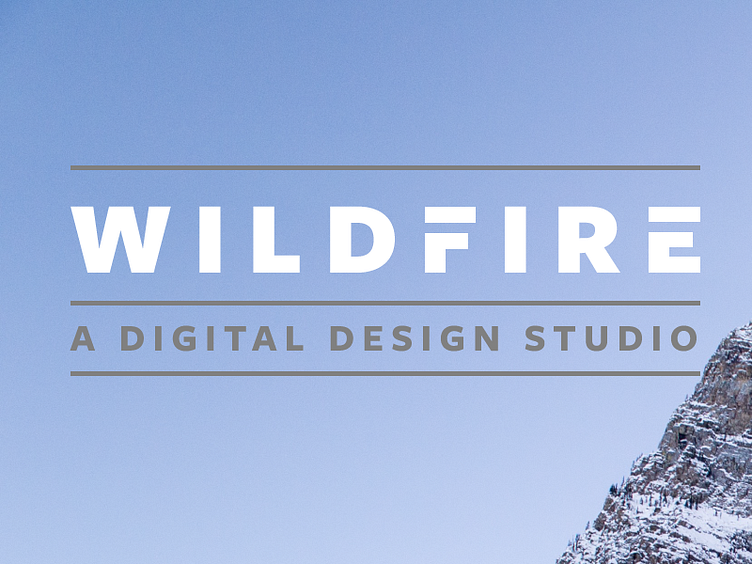
Today I'm doing something similar to Day 25, but using a sans serif font instead. (Not the sans serif I'd like to be using, which is Whitney, but I only have Whitney for web use at the moment.) I wanted to compare and contrast the two different looks and get a feel for which I prefer, but I don't feel like I'm getting as much clarity as I'd like from seeing them side by side.
I'd love to hear your feedback on this: is a wordmark like this too complicated? Should I just throw out some all caps lettering in Whitney like Day 26 and call it a day, letting the logo speak for itself? This sort of brand identity work is new territory for me, as you've probably noticed over the past month.
Looking forward to hearing your thoughts, everybody!