Daily UI 015: On/Off Switch
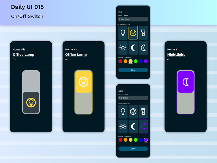
Nice and simple design today. I really like the way that some of the Apple home kit switches work. They are straightforward and there's a few different cues to let users know what's going on with the switch.
Color differentiator for on/off as well as text indicating the state of the switch are the main two.
I wanted to take the switches a step further and allow greater customization with icons and colors to allow the user to personalize their devices with quick renaming as well.
More by Meike Rossman View profile
Like
