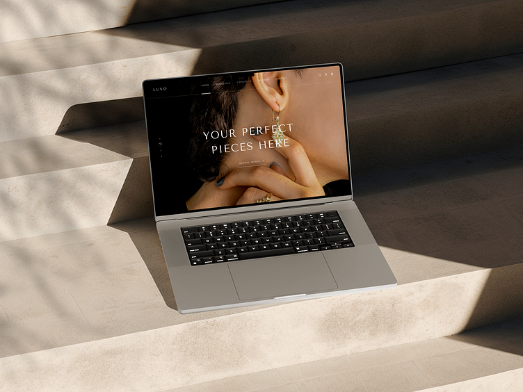
Luxo - Jewellery Website
Case Overview
With a mission to redefine how you experience jewellery online, Luxo worked to make the website easy to use while maintaining an air of elegance. The result? A dazzling online space that welcomes you into a world where every click is a journey into timeless beauty.
The good news is, you can download this design "here", go and check it out now
Design Concept
Our concept revolves around minimalism and luxury. We wanted every aspect of the website to contribute to a sophisticated and opulent user experience.
To achieve this, we opted for a refined brown color palette, complemented by generous white space to enhance the sense of luxury and exclusivity. The color scheme was meticulously chosen to exude richness and a timeless connection to opulence.
Iteration
Carefully curated imagery, highlighting the intricate details of each jewel, further reinforces the sense of indulgence.
The result is a harmonious fusion of minimalism and luxury, inviting visitors into a world where simplicity meets sophistication, and every moment is an immersion in refined beauty.
* My favorite is the Popular Categories section (Slide 2)
What do you think? Feel free to share your thoughts in the comments!
Don't forget to "Press L" if you like it! ❤️
------------------------------------
We are available for your awesome projects! Affordable and satisfaction guaranteed. Just shoot us an email at info@slabdsgn.com and let's chat on Whatsapp
------------------------------------
Check our product 🚀
Creative Market | Envato Elements | UI8
Follow us for more cool stuff ✨


