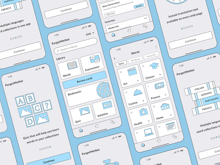
Redesign concept of the language learning app
Hi Dribblers!
Here is a redesign concept of an app for language learning called ForgetMeNot. I chose brutalism aesthetics for this project. All the illustrations for the app were drawn by me in Figma.
The main distinctive feature of the product is a browser tailored for people who learn a foreign language. On any web page in the browser the user can tap a word and instantly gets a word translation from multiple online dictionaries. Translated words can be added to collections so they can be reviewed later and memorised.
Above you can see three of five onboarding screens.
These mock-ups show the Home screen, Words collections screen and list of website bookmarks created by the user.
Let me know what you think about this redesign concept!
Cheers!
More by Lyuba View profile
Like


