SoundHound App Icon ( the making of )

Found these old archive files. Decided to share the work I put into making an icon thats in use on over 260 million devices
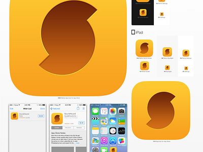
When I started at SoundHound in 2012 there was no single 'app icon'. I synthesized the brands main orange hex codes from all the assets, files and screenshots I was able to find. I then started over and built new vector and bitmap master files based on one unified set of characteristics.
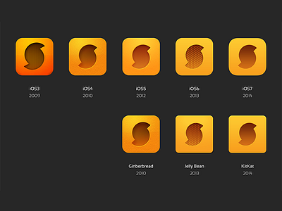
At the time the old 'design' had a microphone mesh texture which was popular in iOS6. I spent a lot of time building and replicating this texture to work correctly on different screen densities. I would later successfully advocate for its removal along with the orange peel texture for iOS7.
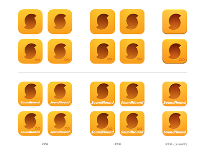
The inner shadow and bevel took along time to get right. I built the vector edge over and over multiple times until I dialed it in and rebuilt then air-brushed it away on individual bitmap icons to where its present but not overly distracting. The shadow which was easy to make in bitmap turned out to not exist in ILCS6. After researching and experimenting I was able to replicate the effect precisely in Illustrator by combining multiple gradient-stroke paths and masking them off.
Because the Android icon was originally converted from iOS5 I reduced the corner roundness by studying several hundred square-ish icons in Google Play and eventually measuring out the angles being used by Facebook and Flipboard. I removed the outer bevel after researching the new flat style in the iOS7 marketplace.
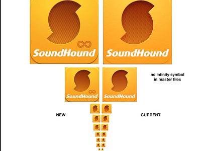
I proposed the discontinuation of the 'logotype-style' icon and tested the new set across launcher screens, stores and in-app GUI systems. I redesigned, uprezzed and brought in-line the Android widget and iterated through many designs for a consistent new "ID now" icon widget.
Very happy with the result of this after hours project. Hope to see the current Android Launcher Icon eventually phased out in favor of a well-designed silhouette icon.

