Fango Food Landing Page Redesign


Complete Thought process
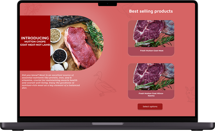
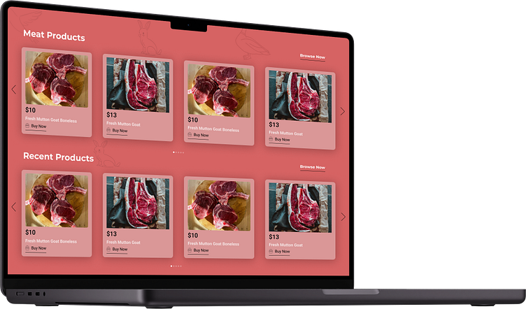
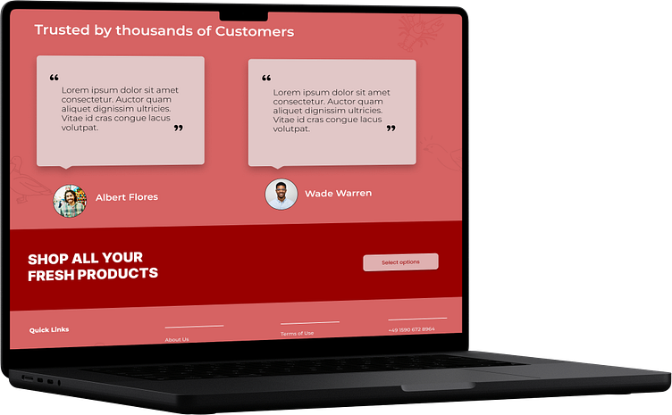
Starting with a brainstorming session, I jotted down what I liked and didn't on sticky notes. Analyzing the feedback, I identified key areas for improvement. After deciding on the color palette and typography, I delved into creating a visually stunning design. Using red as the primary color and Montserrat as the font choice, I curated a modern and bold theme. To add a personal touch, I incorporated illustrations showcasing our shop in the background.
Through thorough research, I meticulously designed the page, strategically placing photos and texts for optimal impact. To infuse friendliness, rounded corners became a consistent design feature. This approach not only enhances the aesthetic but also contributes to a welcoming user experience. The thought process aims for a seamless blend of beauty and functionality, creating a visually appealing and user-friendly Fango Food website.
