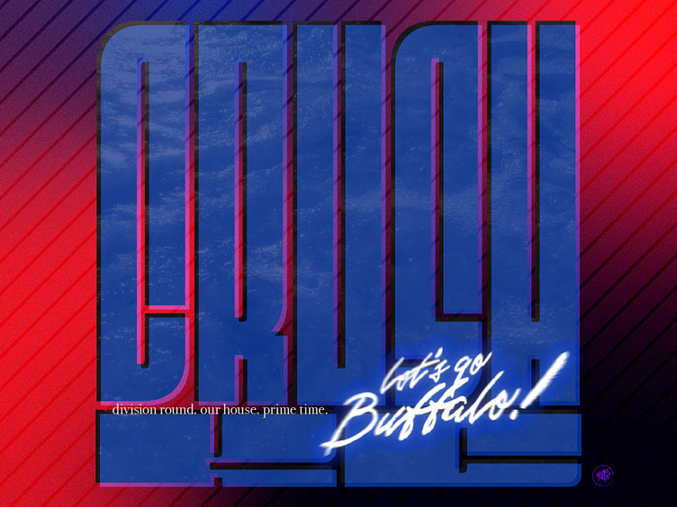
crush KC
couldn't figure out which tagline to use so I made variants with both...
Go Bills
An art piece that says Crush KC in large block letters. overlaid is a nice serif font that says 'division round. our house. primetime' with Let's go Buffalo! in a grungy script next to it. the color scheme of dark blue, red, and black is 90s-esque, aggressive and brooding...
...so much that twitter has flagged it as 'sensitive content' a few times when I've posted it citing 'hateful' or violent content.
While not inherently violent, I guess the rallying cry of 'crush KC' is too much for twitter to handle. my pump up graphics have reached a whole new level and I'm kinda all for it...
may your sacrifices to the pit be worthy this week.
Go Bills
More by Nathan Rundio View profile
Like


