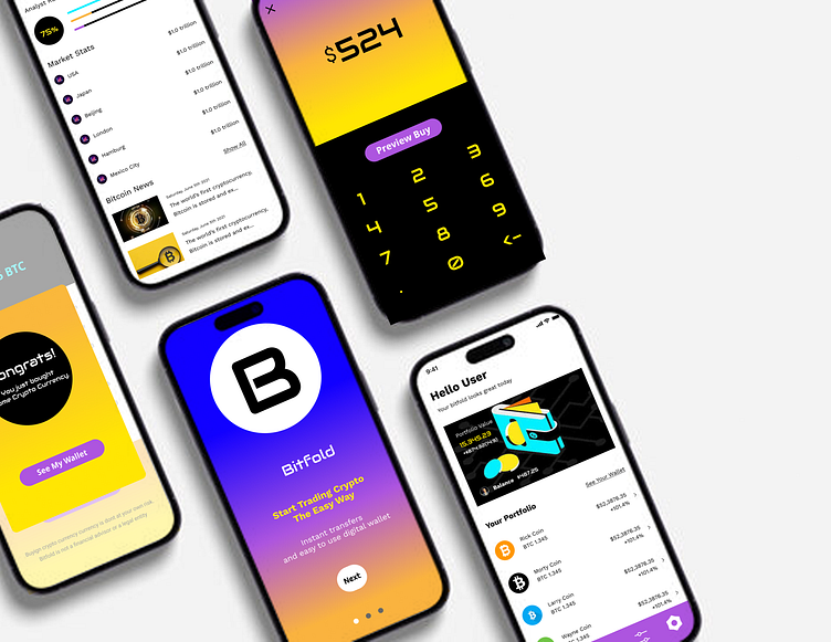
Bitfold - Visual Design for a Crypto App
Bitfold is an imaginary bitcoin app. The brief indicated that this app is intended for users who are new to bitcoin investing. It was meant to be fun, easy to understand, and welcoming to new users.
First steps
I started by doing image searches of the key intentions of the brief - fun, easy, understandable. From there, I image searched money, bitcoin, and Web3. I chose images that resonated with me, and created a variety of possible color palettes.
Applying the color palettes
Once I had my color palettes chosen, I took one screen from the wireframes and applied different versions of the palettes to the main screen. I chose the purple and blue palette to iterate on as it seemed to balance relaxation and openness. My hope is that this would be welcoming to new users.
Beginning to interate
While working on iterations of the chosen color palette, I found a fun image of a bitcoin wallet, and felt that this aligned well with the modern energy of Web3. I took the colors from this image, and modified my palette to better include these additional colors.
Choosing the final screens
After multiple iterations, and nothing quite feeling right, I created a color gradient for the landing screen. I thought that this represented the modern, bright vibes of Web3, but also represented a transition to a new form of banking. To maintain consistency, I applied a version of this gradient where appropriate. I ensured the typography was consistent for body and numbers across the screens. I tried to maintain color consistency for the CTAs across the screens, as well.
Final thoughts
This was a fun exercise! I tend to lean more minimalist and neutral in my colors, so I enjoyed working with bright colors. It was a new thought experiment to try to lean into the Web3 vibes while also trying appropriately break the established rules of color theory in traditional design. This definitely forced me to think out of the box a bit, while also trying to adhere to the rules of good design.


