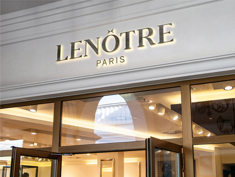
Lenôtre Logo Refresh
Rebranding of La Maison Lenôtre Paris. The aim was to reflect the brand’s original identity while modernizing it, in a way to best represent their main values: prestige, luxury, expertise, sophistication, quality, and tradition.
For the logo, the objective was to highlight the historical and institutional side of the brand through the use of a serif typeface composed of geometric details that give it a modern and elegant look. We wanted to make the O stand out so we chose to extract it and play with the circumflex accent. For that, we doubled and rotated the accent, creating a meeting point that evokes gathering, reception, and sharing, some of the brand's fundamental values. It also has another interpretation: that of a bow-tie, which recalls the servers of large receptions, which are also a big part of the brand. The O on its own could be used as a graphical element and social media icon.
The buttery-yellow colour that we have chosen revives the brand’s original washed-out golden colour, thus making it more modern and trendy, while also emphasising the savoury side of the brand. Yellow is a harmonious and dynamic colour that symbolises wealth, power, and prestige. It is even said that the colour yellow works up an appetite. The grey that we have integrated into this project brings a perfect balance, as it counterbalances the dynamic side of the yellow.


