Pie — Anearmala
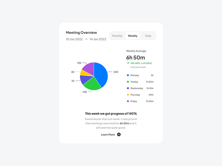
Pie Chart is a chart type that essentially looks as a circle divided into sectors (slices). The full circle (pie) represents the sum of all values in one data set as 100%. The area of each data point, depicted as a slice, is proportional to the value it visualizes. Pie Charts are useful when you need to display the share of each constituent part in a certain total volume.Sectors in such a chart can be not only drawn within the whole circle, but also separated from the rest of the chart making it an exploded Pie Chart.
This type of circular statistical graphic remains informative only when provided with a few constituent parts. Pie Charts with too many slices are hard to effectively work with.
Pie
↳ Design by Anearmala 🎉
New post every weekday on X (Twitter) + free assets coming soon.
Have a figmadays!
