We Created a Playful & Whimsical Packaging Design for The Pantry
The Pantry is a Dubai-Based company that focuses on providing healthy food for everyday life. Their mission is to deliver high-quality snacks with affordable prices and international quality.
It all started when the owner of the brand came to us looking for a new a packaging design. Her aim was to have an outstanding and astonishing look on the shelves of supermarkets.
Our thought: healthy food doesn’t always have to be clean and delicate. It can also be bold, fun and colorful.
It began with a deep exploration of the brand's identity and the message it aimed to convey.
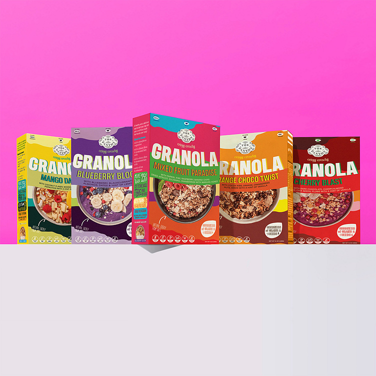
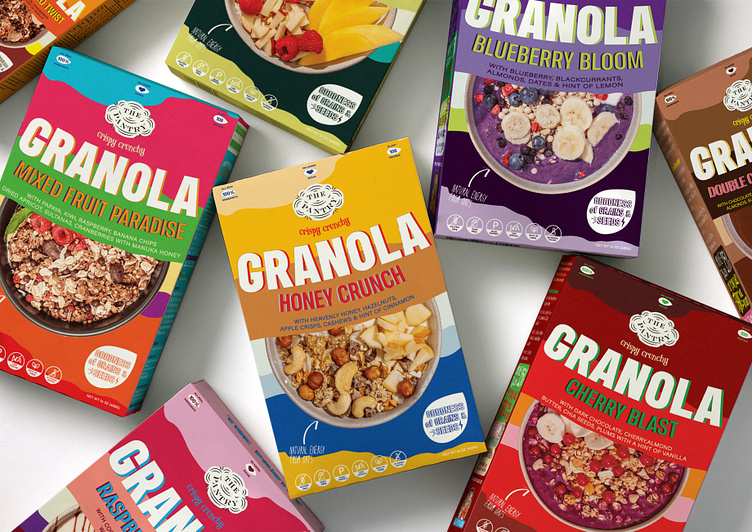
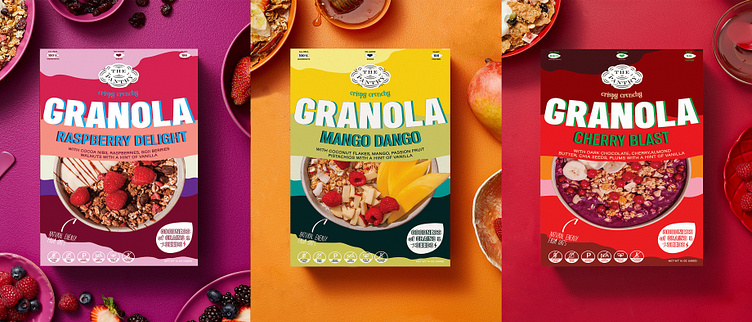
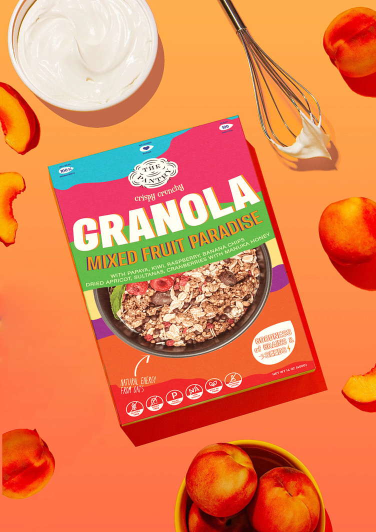
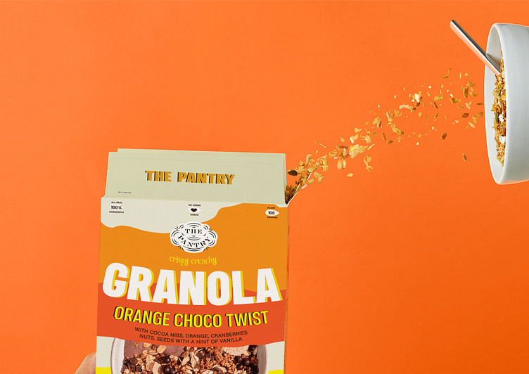
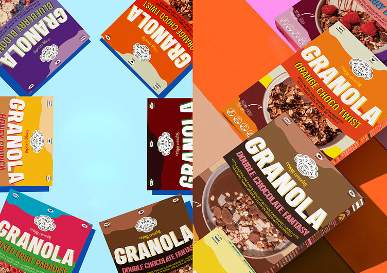
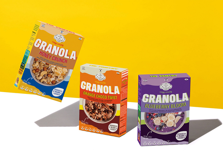
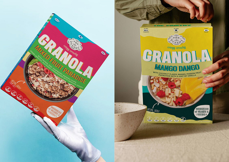
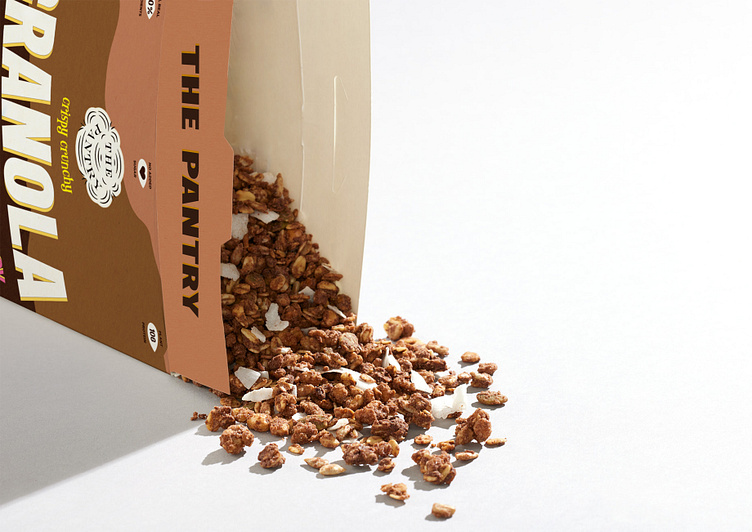
The Pantry wanted to express the idea that their granola is not just a breakfast option but a delightful experience, offering surprising and unusual flavors that awaken the senses. That’s the reason why The Pantry Granola involves lots of bright colors, bold typography and a variety of cool graphic elements. Each granola flavor is assigned a distinct color, drawn from the primary ingredient that characterizes its taste profile. For instance, the “orange choco twist” flavor is represented by warm and inviting shades, while the “blueberry bloom” variety showcases a color palette that reflects the essence of its ingredients. “double chocolate fantasy” granola embraces a rich, decadent color scheme, and the “mango-dango” version draws on vibrant, earthy tones.
We are presenting an effortless yet eye-catching design that will attract the customers, even from the top shelves.
Thankyou for Watching!
Agency: TwoX Studio | Instagram | Email | Twitter
Follow us on instagram: @twoxstudio
Let's work together soon!
