Goodles | CRO
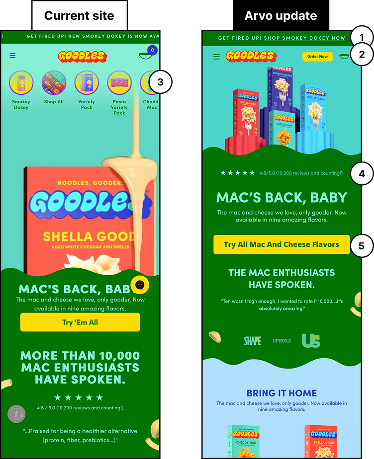
We recently designed a mockup explaining 5 tests we'd run for Gal Gadot's Goodles to increase their overall conversions:
1) Make sure the announcement bar provides a CTA link so that users can take the desired action quickly.
2) There is plenty of space in the navigation so let’s utilize it by adding a distinctive CTA that will get users into the purchasing funnel.
3) The extra icon navigation can create confusion as it isn’t quite clear and it repeats what is contained in the hamburger menu. Let’s create more space by leaving these items in the hamburger menu which will bring your highlighted message and products further up on the page.
4) Positive reviews are a great way to build trust with users new to your brand — pull them up the page and display them prominently above the fold, and call out the total number!
5) Use your action button as a communication point — rather than “Try ‘Em All”, reiterate your product.
