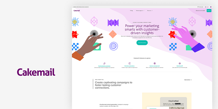
Cakemail Marketing Website
My Role
I was tasked with delivering a fully functional responsive website used to promote Cakemail's product offerings, while continuing to deliver value to app users by expanding in-app features.
✅ Stick to brand guidelines
✅ Align with marketing goals
✅ Test functionality
Tools & Tech
Figma
Webflow
One of the main drivers for this project was to shift away from WordPress and into Webflow which helped push the UX, sped up page load, and made it easier for the team to add and update content.
Features (Home)
To reduce the scope of the project, I centralized Cakemail's core features on a single page that outlined the products core offering, leveraged social proof, and drove users to start using the app by creating a free account.
(Once time permitted, individual feature pages could be added to help funnel visitors into the app by aligning onboarding flows with the goals of each user segment.)
Plans & Pricing
When designing the Plans & Pricing section, my focus was on clear, quick info on plan tiers and a pricing calculator that adjusts for audience size. I added standout CTAs for each plan and a section for FAQs to help users and cut down on support questions. The goal was to make things easier for users to compare and choose what they need.
Icons
The icons for Cakemail's website were crafted with a unified aesthetic, showcasing clean, geometric shapes on a precise 32x32 pixel grid for optimal clarity and consistency. Each icon, with its simplified form and balanced proportions, is designed for immediate recognition across the entire ecosystem.


