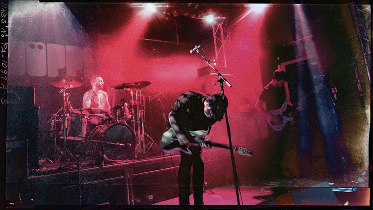
Döppler
When Döppler, a London-based rock band – inspired by the likes of Muse and Nine Inch Nails – sought a fresh logo, they aimed for something iconic, akin to Muse's stamp-like emblem. The challenge was crafting a logo that not only embodied their musical influences but also checked every box for a band's visual identity — from posters to tattoos, exuding the "frickin' cool" factor.
Döppler's name itself held scientific significance – the Döppler Effect, a concept describing the shift in frequency perceived by an observer moving relative to a wave source (think the changing sound of an ambulance passing by). The pivotal moment came in incorporating the accent on the "ö" seamlessly into the letterform. This transformation not only contained the wordmark but also rendered it highly adaptable for various applications, from flight cases to band tees, making it stencil and sticker-friendly.
The logo's unveiling elicited excitement among the band members, who found the design "vampire-like." Its fusion of musical inspiration and scientific nod encapsulated Döppler's essence, symbolising their sonic journey akin to the dynamic shift in a wave's frequency. The revamped logo, echoing the band's Muse-inspired stamp-like aesthetic, became the quintessential visual anchor, poised to adorn album covers and stage backdrops, marking a new chapter in Döppler's visual identity.


