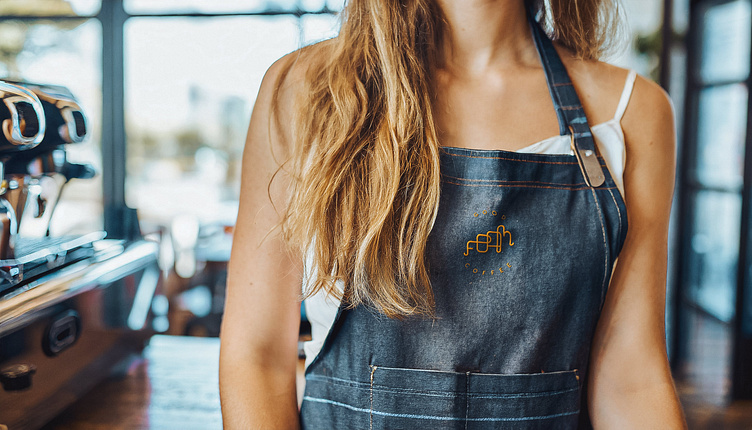
Foam
Crafting a unique identity for a modern yet rooted-in-tradition coffee shop was a collaborative journey between myself and the client. Our shared vision steered us away from the conventional coffee bean logos, prompting an immersive exploration into the rich history of coffee-making.
Drawing inspiration from the unique bell like shape and intricate pipelines of early 20th-century coffee machines, the logotype was meticulously fashioned. Its sinuous curves and interwoven lines echo the nostalgia of traditional craftsmanship while seamlessly integrating the comforting, frothy and bubbly contours reminiscent of milk foam.
This design is more than a symbol; it's a narrative woven into the brand's essence. Each curve and flow encapsulates the spirit of this coffee haven, paying homage to its heritage while embracing a contemporary vibe. By steering clear of clichés, this logotype stands as a testament to the brand's commitment to uniqueness, embodying the fusion of history and modernity that defines the coffee shop's character.


