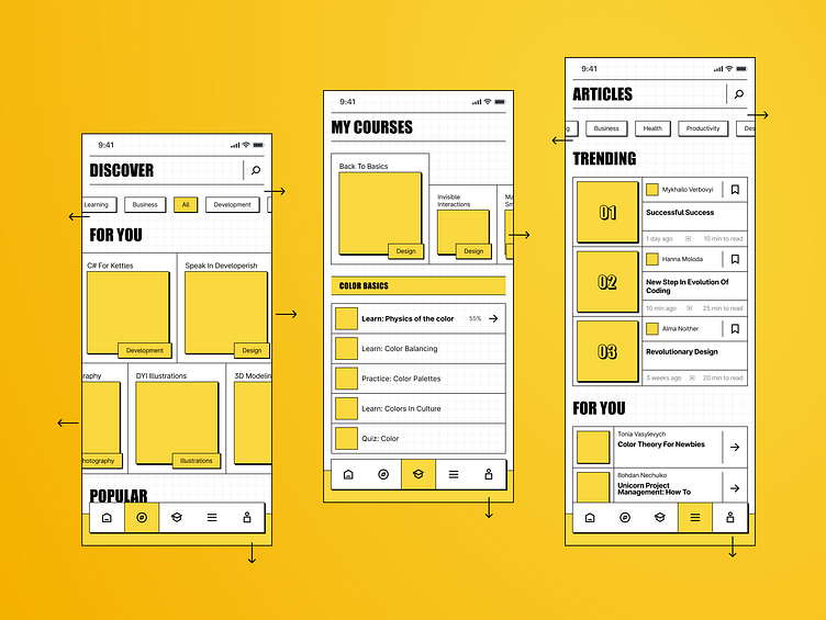
Educational App Concept - Light Brutalism
This concept was created because I wanted to practice in a little bit different style and grid set. This concept has the idea of self-scroll: the row wth topic chip or courses are supposed to slide, not too fast, by itself into the opposite directions. Smooth like butter!
Here I have infinite rows of courses made in carousel, lessons on the scsreen dedicated only to the currently chosen course and this greed-kind of way to display the information. However, I wanted to make it a bit more special, more free and I wanted to remember how it is fo design in a light theme 😁
denga.anastasiya@gmail.com
More by Anastasiia View profile
Like
