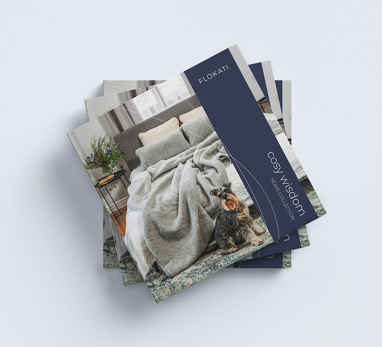
Wool Product Square Catalogue Design
team@maketone.design | www.maketone.design
Conceptualization: The design journey commenced with a thorough understanding of a company brand identity and the unique characteristics of their wool products. We envisioned a catalogue that would not only showcase the diversity of company offerings but also narrate a story of luxury and comfort. The concept took shape with a focus on thin hair elements, mirroring the delicate fibers of the premium wool.
Visualizing Luxury: The choice of a square format was deliberate, providing a canvas that allowed for a harmonious balance of images, text, and negative space. Every page was carefully curated to create a visual symphony, emphasizing the luxurious appeal of wool products. The layout emphasizes clarity, ensuring that each product is presented in its truest form.
Thin Hair Elements: The inclusion of thin hair elements became a defining feature of this catalogue. These delicate strands, strategically placed throughout the pages, convey a sense of opulence and sophistication. Mimicking the texture of wool, these elements not only add visual interest but also serve as a tactile reminder of the softness products offer.
Color Palette: The calm and soft color palette chosen for the catalogue was a nod to the gentle hues found in wool products. The subdued tones create a seamless flow from page to page, evoking a serene atmosphere that mirrors the soothing touch of company textiles. Each color was selected with precision to complement the textures and fibers showcased in the catalogue.
5. User Experience: Considerable attention was paid to the overall user experience. The layout ensures a smooth and intuitive flow, guiding the reader through a captivating journey of wool exploration. From the initial glimpse of the cover to the detailed product descriptions, every element was strategically placed to engage and delight the audience.


