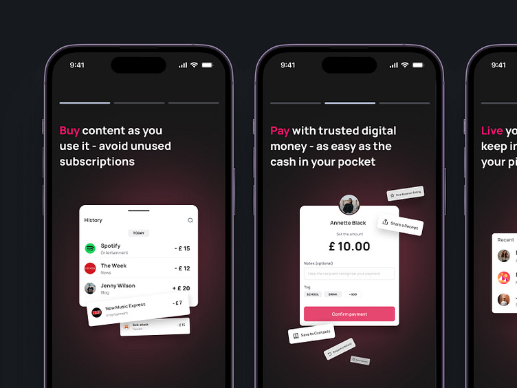
pingNpay. Mobile Onboarding
Hello there, Dribbblers 🙌🏻
We present you onboarding for one of the applications. Visually clear meaning of each slide thanks to visual illustrations. It is also crucial to show the progress bug, which lets the user know how many slides are left. Also for fast scanning of the text we have highlighted keywords in bright crimson color, so even if the user will ignore the slides, this text will definitely attract his attention.
Learn more about pingNpay in our Case Study 🔬
If you what to start a project, contact us via hello@equal.design
Analytics over hypotheticals! We are ready to cooperate!
hello@equal.design | equal.design
❤️ Follow us to stay involved 🏆
More by Equal View profile
Like

