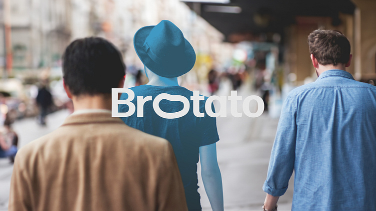
Br🥔tato
Brotato, a brand focused on men’s mental health and well-being, sought to create an inclusive and approachable space for men aged 20-50, leveraging the term "bro" as an endearing nod to community and support.
The brand's core mission was to destigmatise mental health conversations among men, blending a sense of camaraderie with accessible resources. At the heart of Brotato's identity lay its versatile logo — a depiction featuring a potato-shaped emblem in place of the first "o." This adaptable mark ensured consistency across various mediums, resonating with its audience by symbolising resilience and approachability.
The brand strategy centred on merging physical merchandise and a user-friendly app to establish a cohesive presence. Brotato's merchandise, including stickers, stationery, and apparel, serve as tangible extensions of the brand, fostering a sense of belonging within the community. Simultaneously, the app provides an easily accessible digital hub for men to access resources, engage in discussions, and seek support, helping to erase the barriers surrounding mental health dialogues among men.
By harnessing the inclusive connotation of the term "bro" and encapsulating it within an adaptable logo, we successfully crafted a brand identity that would resonate with their target audience. The seamless integration of physical merchandise and an accessible app not only facilitates open conversations but also establishes Brotato as a beacon of approachability and support for men navigating mental health concerns.


