Mono - Redesign Exploration
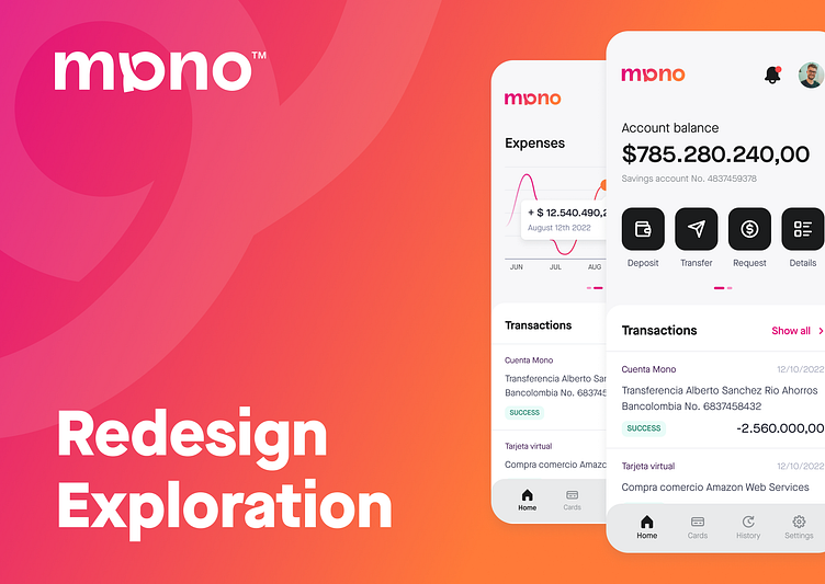
During my time at Mono, we decided to do a rebrand and redefine our visual identity, with it we had a logo change and a complete overhaul of our color palette and component usage, this is one of my initial pitches to a more exciting, inviting and user-friendly visual identity.
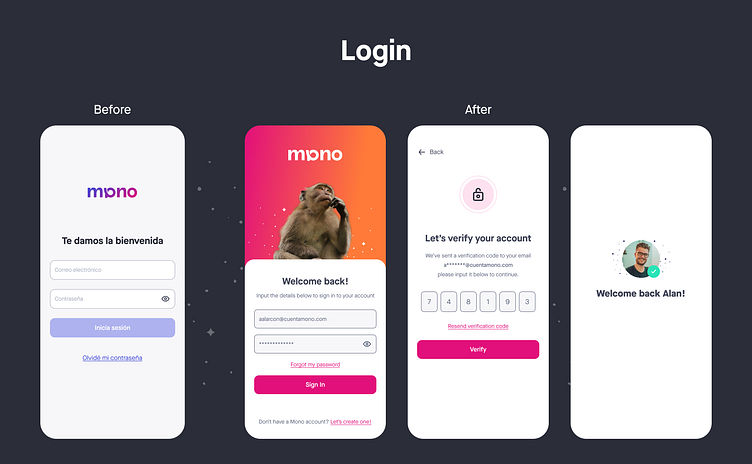
1. Login Experience
I decided to give the log in a fresh new look, leaning into the brand concept we settled with (Mono = Monkey in Spanish)
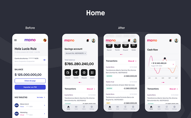
2. Home Screen
I wanted to make the home screen more useful and accessible, getting rid of the hamburger menu, bringing more important actions to the main screen and adding extra functionality like a graph that would show the cash flow over the last 6 months.
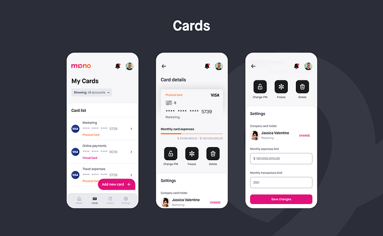
3. Cards
Created a brand-new independent cards section where users could create new virtual cards, request physical ones and could also manage card owners and expense limits.
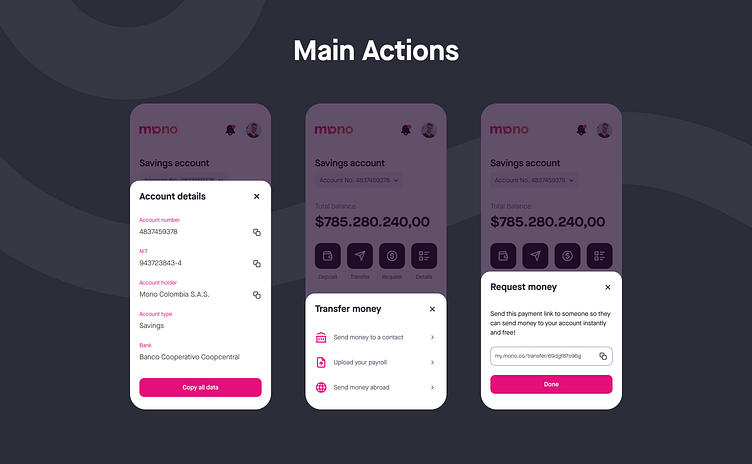
4. Main Home Actions
Brought some of the more hidden and importan actins to the main home screen, making the easy to access with a more dynamic look.
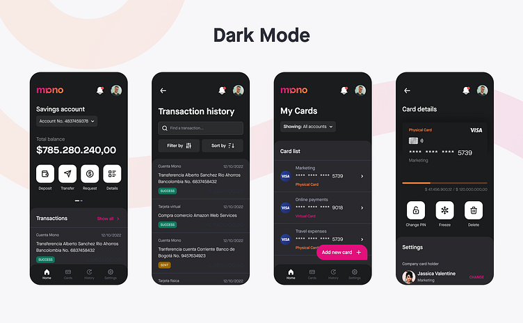
5. Dark Mode
To aid accessibility and user choice, I also pitched a dark mode that would give the app a more interesting look and reduce eye strain.
2022 All rights reserved Mono Colombia S.A.S.
Thanks for checking out my project!
Hope you enjoyed it and have a great day!
Want to work together?
⭐ Email me at: alanalarcon_@outlook.com
See you in my next shot!
