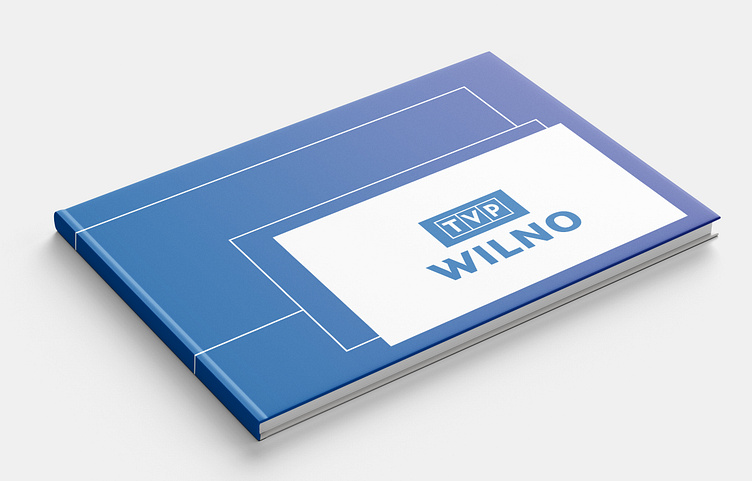
Poland TV Channel program presentation publication
team@maketone.design | www.maketone.design
As we step into the new year, we are thrilled to unveil our cutting-edge TV Channel Program Presentation Design that embodies modernity, simplicity, and informativeness. Our design is a visual delight, incorporating white-bordered squares reminiscent of TV monitors and a vibrant palette of blue hues, creating a sleek and engaging layout that promises to captivate your audience.
Key Features of the Layout Design:
White-Bordered Squares: Each program is housed within a crisp white border, evoking the classic aesthetics of TV monitors. This not only pays homage to the roots of television but also creates a visual coherence, making the entire presentation feel unified.
Consistent Grid Structure: The layout adheres to a grid structure, establishing a sense of order and making it easier for viewers to navigate. This consistency enhances the overall visual appeal and reinforces the modern and sophisticated feel.
Blue Color Variations: The incorporation of blue hues serves a dual purpose. Beyond aesthetics, blue is associated with trust and technology, reinforcing the reliability of our TV channel and the cutting-edge nature of our programming.
Readable Typography: Clear, legible fonts are strategically employed to ensure that program details, such as titles and airing times, are easily readable. The typography complements the overall modern aesthetic, contributing to the user-friendly experience.
Strategic Use of Negative Space: The layout design embraces negative space, allowing each element to breathe and preventing visual overload. This intentional use of space enhances the overall visual appeal and readability.
In essence, our layout design is a meticulous orchestration of visual elements, guided by the principles of clarity, simplicity, and modernity. It transforms the TV viewing experience, making information accessible, programs enticing, and the overall presentation a visual masterpiece for the dawn of a new year.


