Mono - Design System
Overview
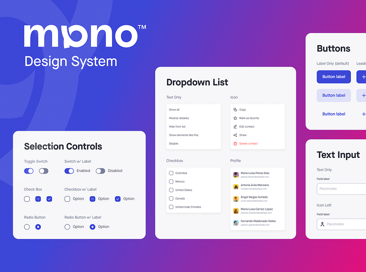
As part of Mono's design team and being the first designer hired in an early-stage startup, one of my biggest tasks was to build a design system that would allow us to be extremely flexible, build screens and flows quickly and stablish a visual identity for the product, so time was of the essence. As a result, I took a more streamlined approach to building a design system that was still deeply rooted on the atomic design principles, so I divided the system in 4 categories, these are just some of the components I built for Mono's design system.
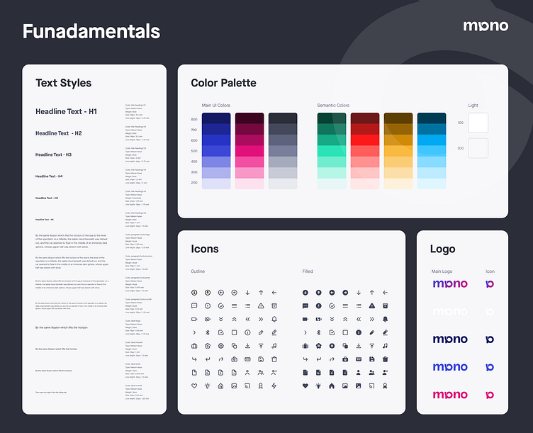
1. Fundamentals
These are the most basic elements needed to start building more complex components, these are often comprised of colors, font, icons, grid system and container styles.
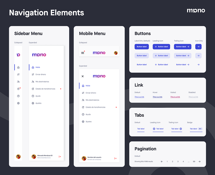
2. Navigation Elements
These components allow the user to interact and navigate through the UI, often taking the user to different pages, call different actions and start new flows.
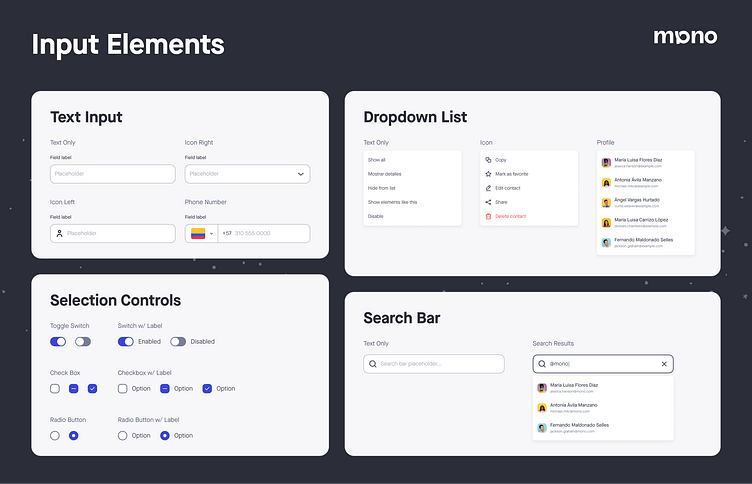
3. Input Elements
These components allow the user to input information and select options needed to trigger events and navigate the UI
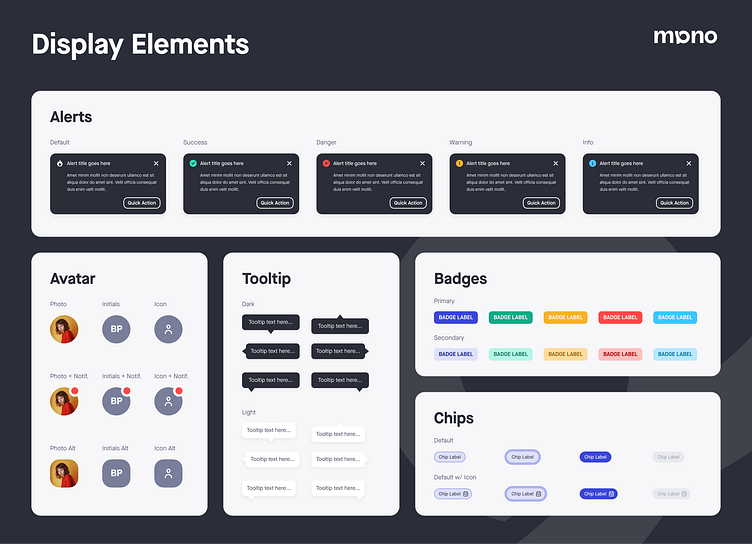
4. Display Elements
These components are used to show different information to the user depending on the context.
2022 All rights reserved Mono Colombia S.A.S.
Thanks for checking out my project!
Hope you enjoyed it and have a great day!
Want to work together?
⭐ Email me at: alanalarcon_@outlook.com
See you in my next shot!