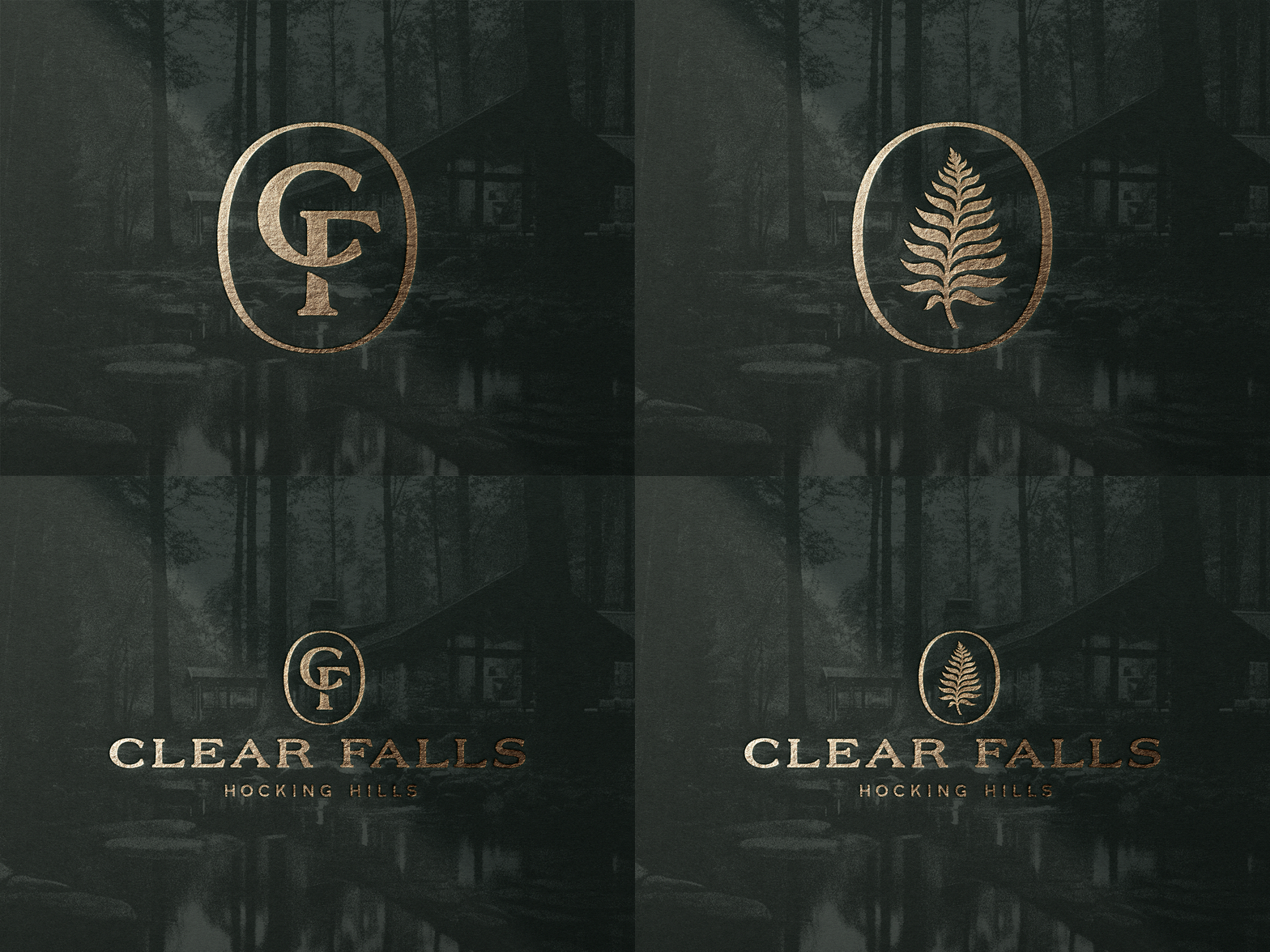
Clear Falls Logos
Primary logos for Clear Falls. This is part of a brand project for a client building a luxury lodge and cabins. We developed a logo story between the monogram and fern marks, allowing them to be used interchangeably depending on the application. The monogram speaks to the rustic side of the brand, while the fern marks are used for the more upscale elements related to the destination. Excited to share more on this project soon.
More by Nick Johnston View profile
Like
