MOSBUILD Visual Brand Identity
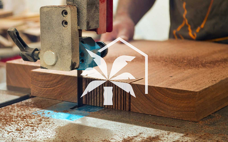
Embarking on the visual journey with MOSBUILD Construction & Property Maintenance, we crafted a robust Logo Package and Brand Identity that speaks volumes about their professionalism and commitment. The primary and secondary logos, complemented by a distinctive logomark, were designed to reflect the quality of work and reliability synonymous with this Cairns-based construction company.
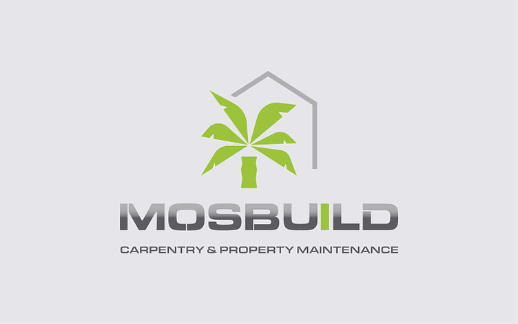
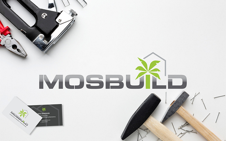
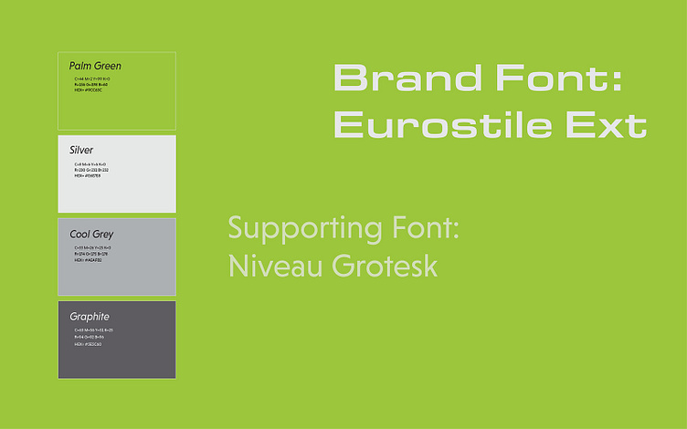
The colour palette, a harmonious blend of silver and charcoal, exudes a bold and masculine aura, symbolising the solidity of MOSBUILD's services. To add a touch of tropical vibrancy, we introduced lush green hues inspired by the iconic palm trees of Cairns.
Business cards became a tactile extension of their brand identity, keeping the design minimalist but with bold colour choices. The result is a cohesive brand identity that not only resonates with MOSBUILD's values but also stands out in the competitive construction landscape. It was a pleasure working on this project, translating ideas into a visual identity that perfectly represents the excellence of MOSBUILD Construction & Property Maintenance.