Equidato – Brand concept
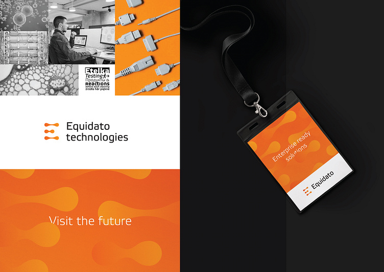
The Equidato brand concept is based on soft shapes and lines, which are not common in the IT sector. This creates a contrast and sets us apart from other brands in the industry. The inspiration for the concept comes from cell division, symbolizing the creation of a new structure.
The symbol (letter "E") is composed of dividing cells, and, together with unconventional colors and gradient usage, it creates a modern visual identity for the IT sector, aiming for growth and development.
The shade of orange has been carefully chosen to contrast well on both white and dark backgrounds. We sought a color tone that exudes a friendly character while standing out from standard competing brands.
>>>
If you are interested in a similar branding approach for your brand, feel free to reach out to me.


