Habit Harmony - Visual Identity Concept


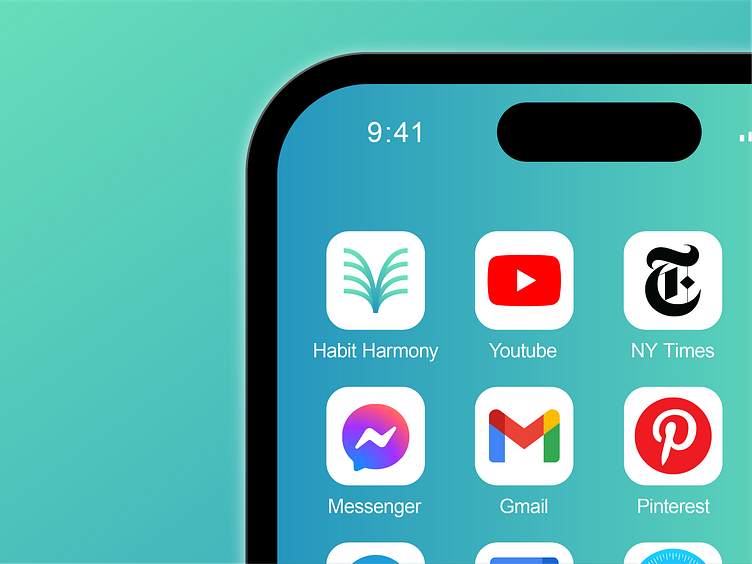

A visual identity concept i did for habit harmony, An impact-first social enterprise seeking to help people enjoy long and fulfilling lives.
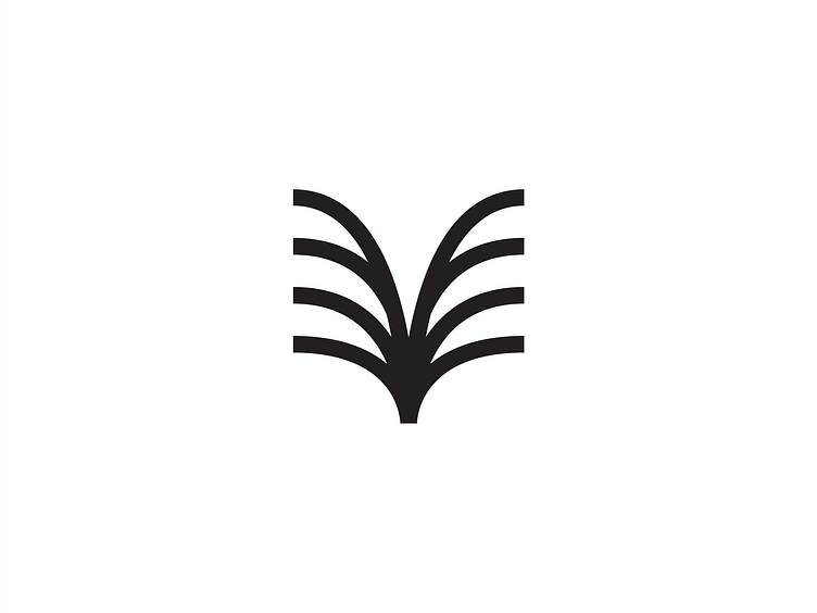
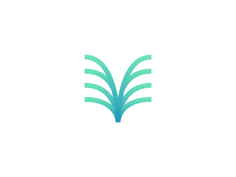
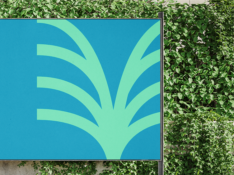
The take on this concept was more to a nature and organic feel, since it would fit the tone of the brand so well. Plant-like symbol combined with a green and pastel color to match the vibe of an organic and warm feel.
The logo consist of 3 different meanings, the green and pastel colors to represent nature, the 8 lines or leaflet in between the stem to represents growth, while the combination of both represents prosperity and fruitfulness.
Feedback are welcome!
Contact
For any business and inquiries, feel free to contact me at :
Email = felixchristopherafrian@gmail.com
Linkedin = Felix Christopher Afrian
Instagram = @felixlog_
Thank you!

