Marketing website design

The design process for this marketing company's website was a comprehensive journey, meticulously executed to ensure a seamless and visually appealing user experience. Leveraging the powerful combination of FigJam and Figma, I incorporated a user-centric approach grounded in UX principles.
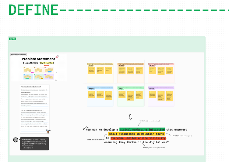
1. UX Process with FigJam:
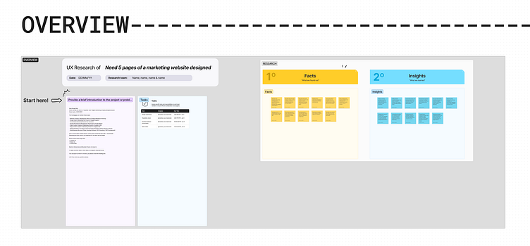
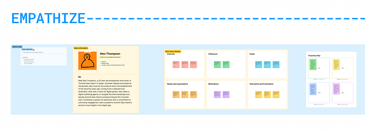
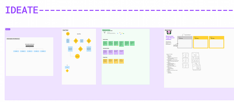
Conducted initial research and brainstorming sessions in FigJam to outline user personas, user flows, and empathy maps.
Collaborated with stakeholders, refining ideas and validating concepts through live collaborative sessions in FigJam.
Utilized FigJam's affinity mapping features for organizing and synthesizing insights gathered from UX research.
2. Figma Design for Visual Excellence:
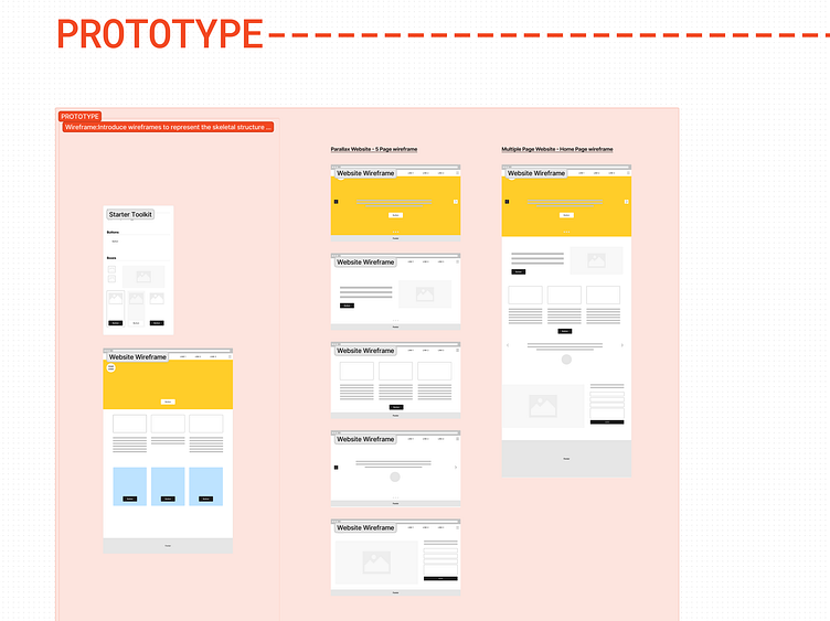
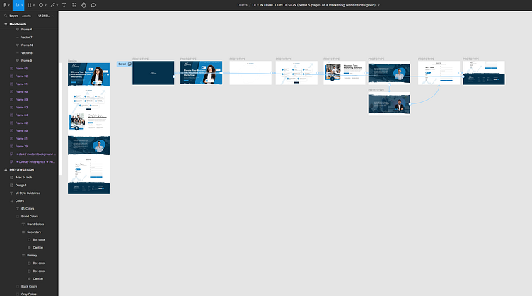
Translated UX insights into tangible design elements using Figma, ensuring a seamless transition from wireframes to high-fidelity mockups.
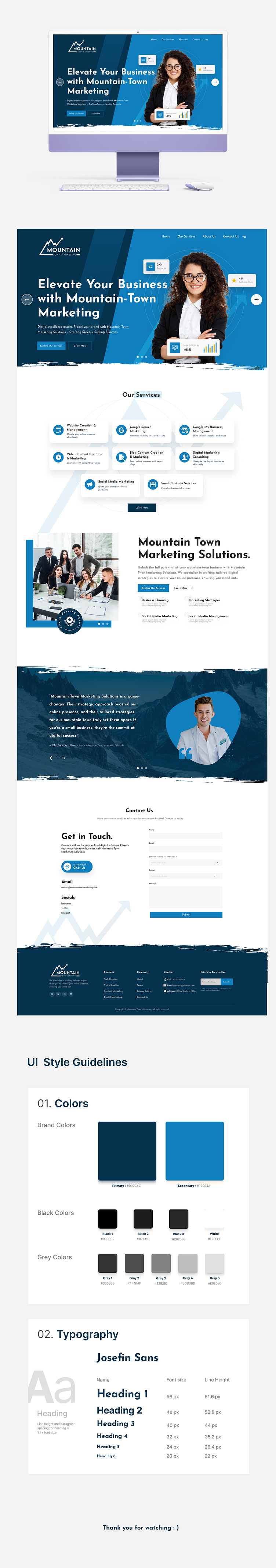
Applied color theory principles to select a palette that resonates with mountain-town aesthetics, incorporating whites, blacks, and subtle blues and oranges for contrast and emphasis.
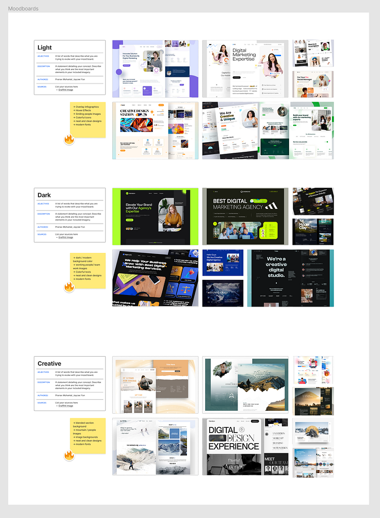
Developed a moodboard to encapsulate the essence of mountain towns, inspiring the overall design language.
3. Prototyping for Interaction and Animation:
Employed Figma's prototyping capabilities to bring static designs to life, creating interactive and engaging user experiences.
Integrated subtle animations to enhance user engagement and provide a dynamic feel to key elements.
Conducted usability testing through Figma prototypes, ensuring the functionality and flow aligned seamlessly with user expectations.
4. Iterative Design Process:
Embraced an iterative design process, refining layouts and visual elements based on feedback loops with stakeholders and usability testing results.
Utilized Figma's version control to manage design iterations efficiently and maintain a clear design history.
By combining the collaborative power of FigJam for UX processes, Figma for meticulous design, and prototyping for interactive experiences, the resulting website is a harmonious blend of aesthetic appeal and user-centered functionality. The color scheme, inspired by mountain-town vibes, contributes to a visually pleasing and cohesive brand identity, creating a memorable and effective digital presence for the marketing company.