KARON CONSULTING GROUP Ip
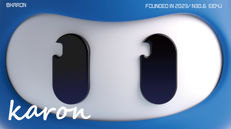
IP DESIGN
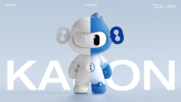
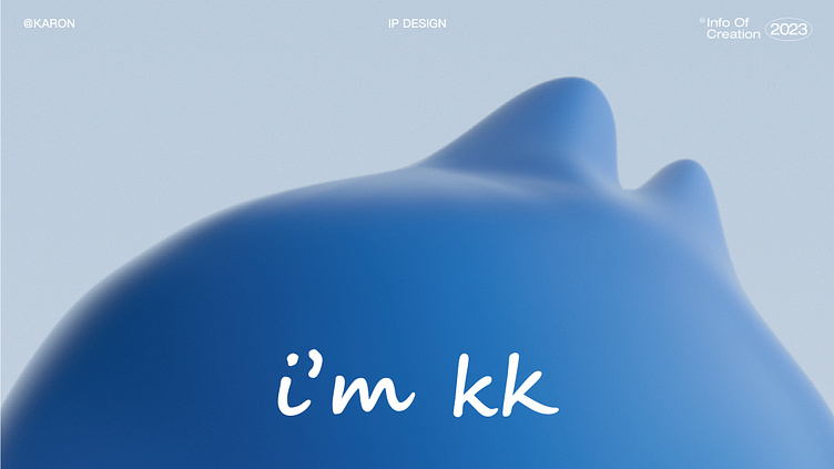
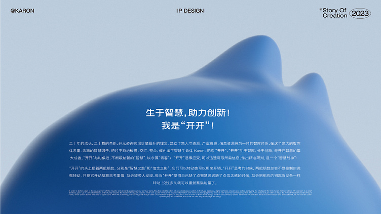
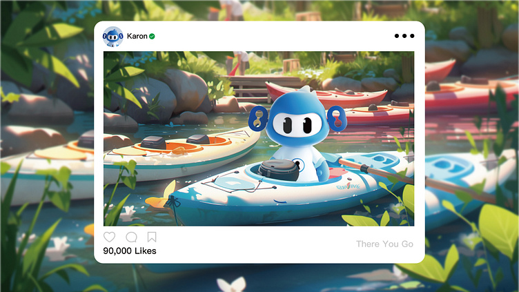
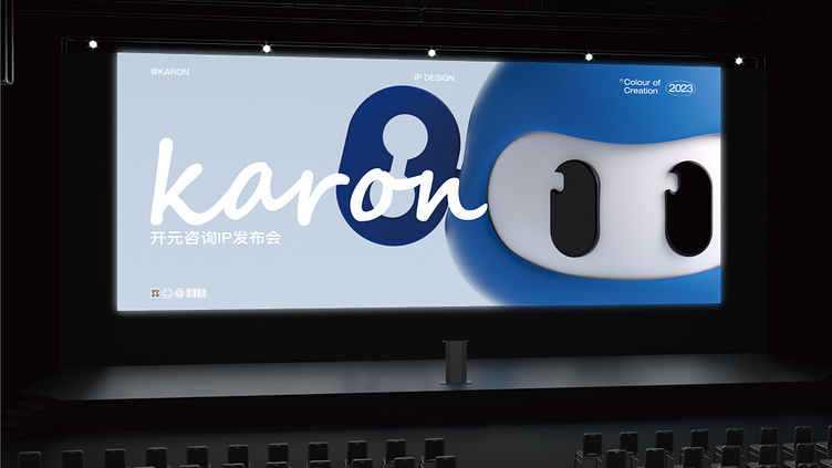
This is a project I led at MarkCat Company. On October 18, at the 20th anniversary celebration dinner of Kaiyuan Consulting Group held in Chengdu, the new IP image "Kaikai" was officially unveiled!
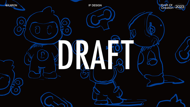
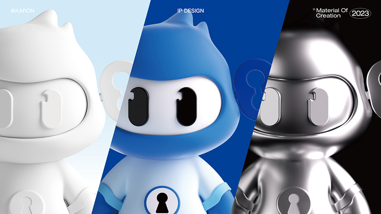
Before this, we tried many different prototypes, using animals such as rhinos, elephants, etc. to highlight the company's authority. At the same time, we also tried many designs based on human prototypes to highlight the company’s wisdom.
Heading
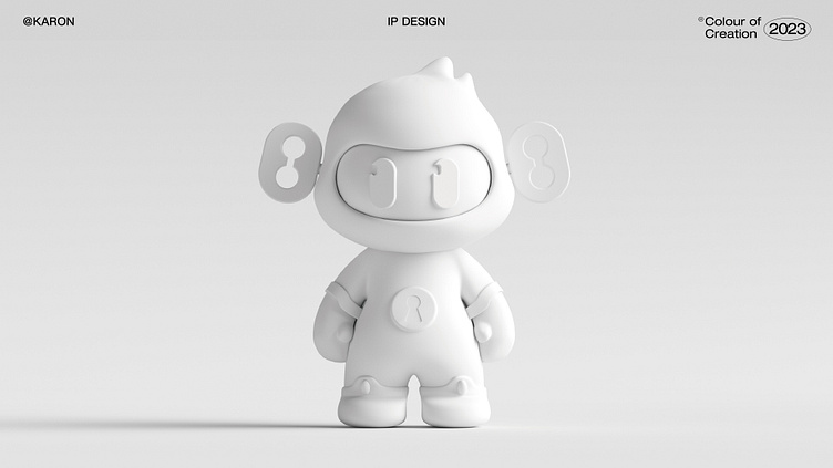
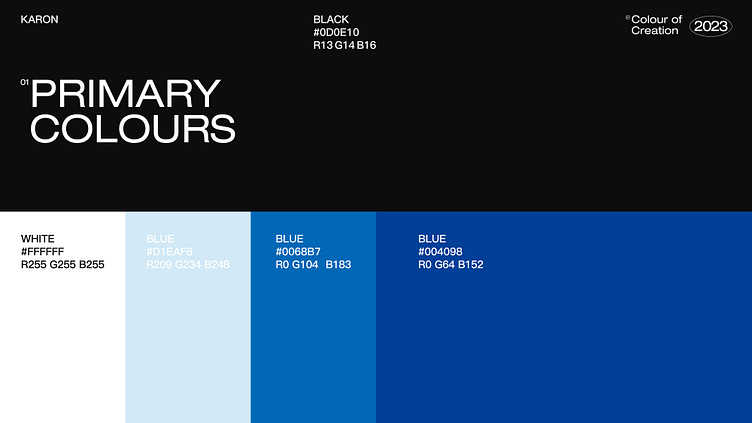
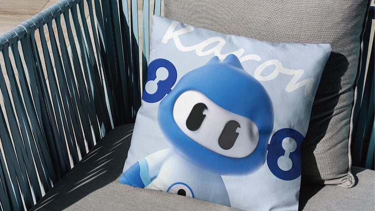
Based on the company's brand color, we applied it to IP to increase the sense of brand belonging.

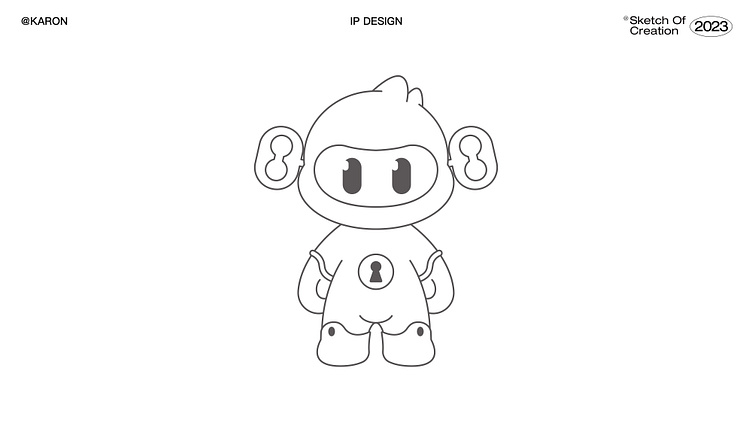
Detail
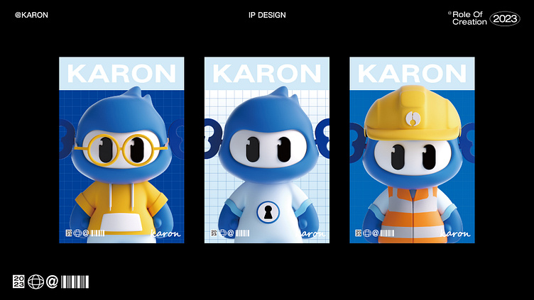
Personality
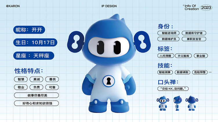
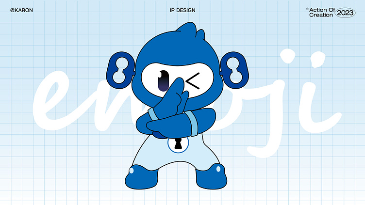
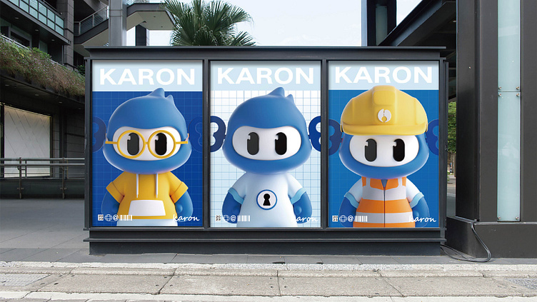
We gave the IP some human personalities
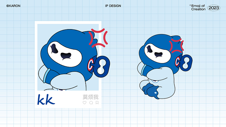
We also tried to develop some expression design, dynamic design, and character design for it.
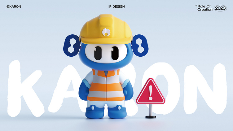
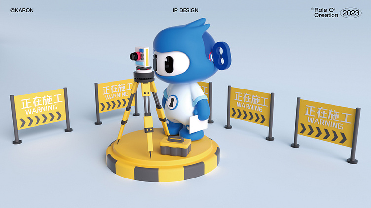

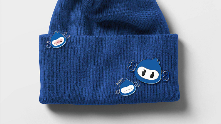
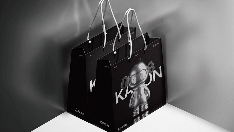
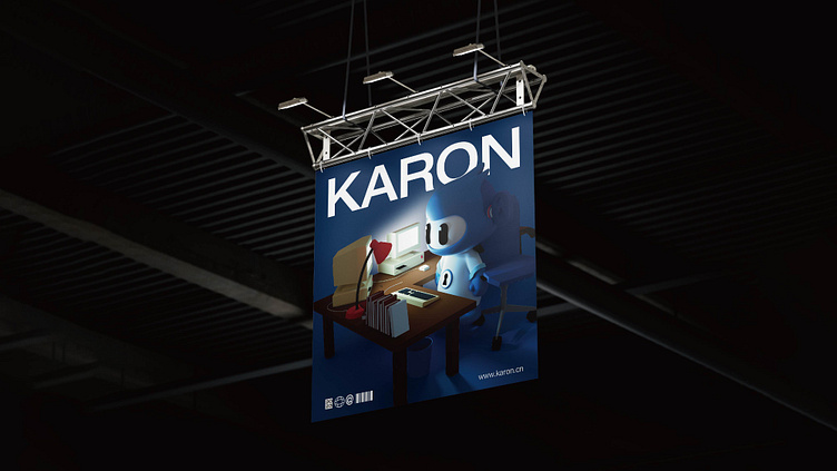
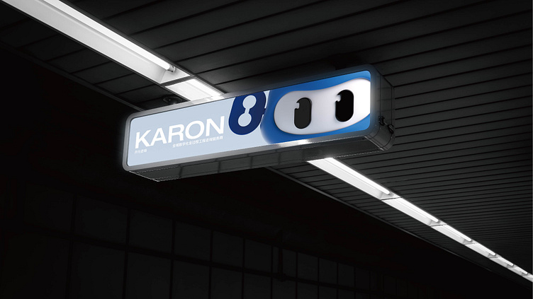
Some peripheral designs
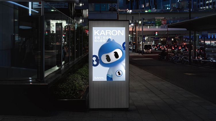
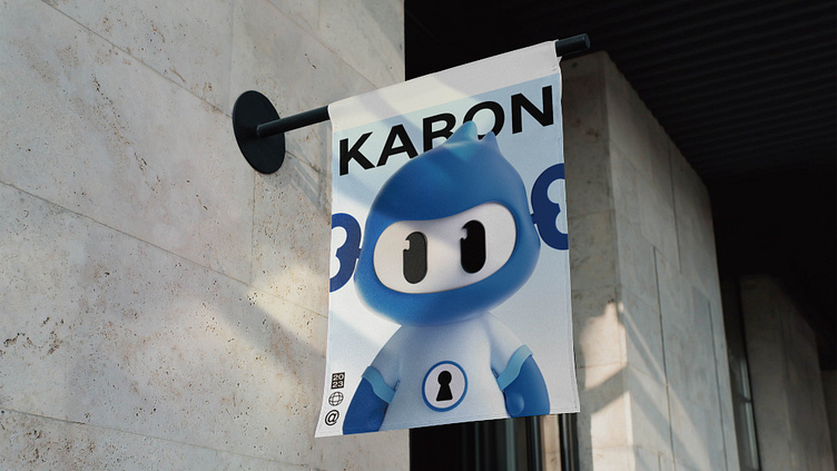
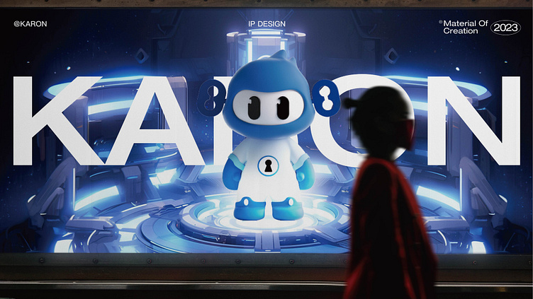
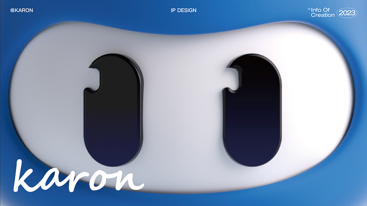
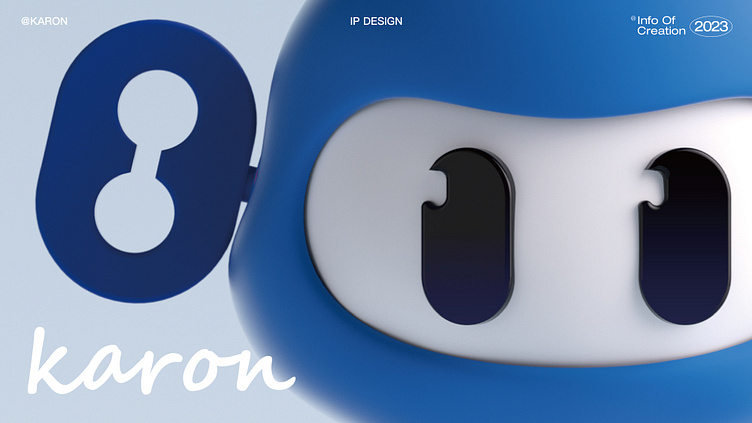
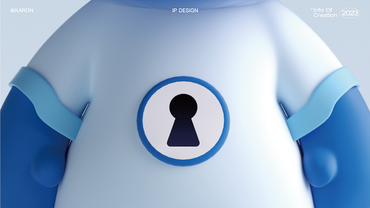
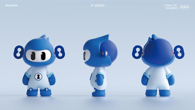
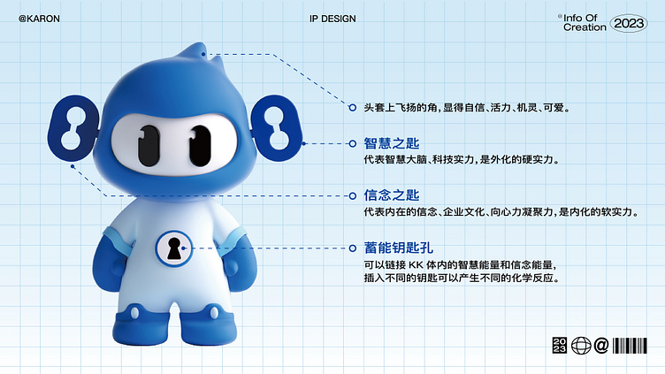
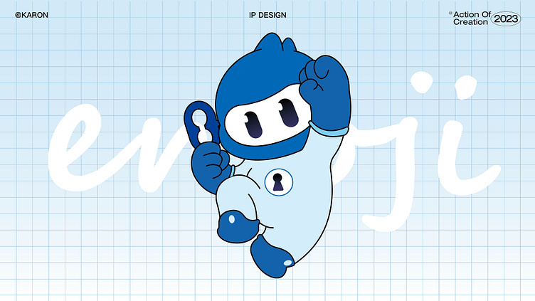
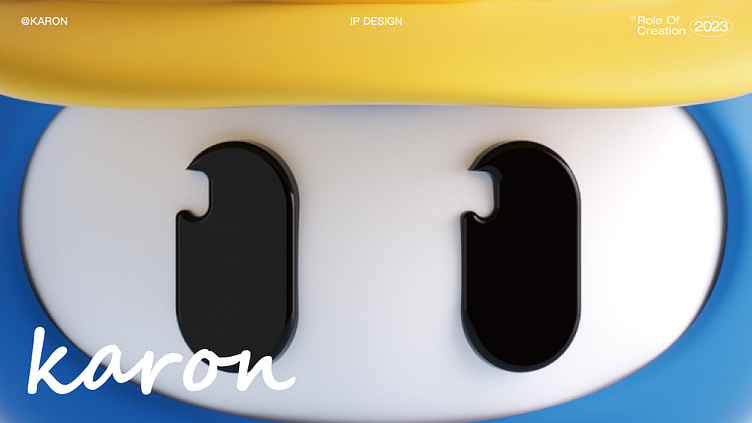
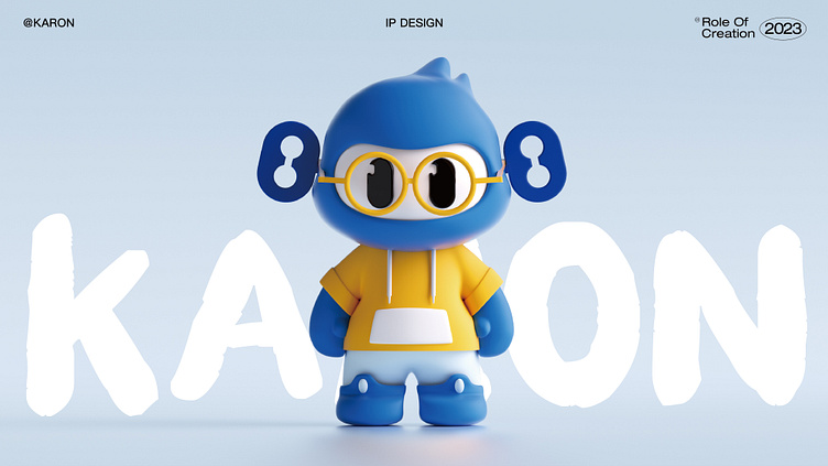
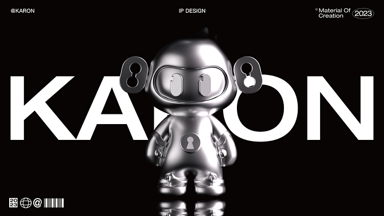
The corporate VI color of Kaiyuan Consulting Group is blue, which represents reason and wisdom; "evolver pursuing the key to life" is the differentiated identification feature of corporate IP. The combination of the two concretizes the abstract corporate culture and gives birth to a new brand IP one - KAI KAI. The key on the left side of the head is the "Key of Wisdom", which represents technological strength and is external hard power; the right side of the head is the "Key of Faith", which represents inner belief, corporate culture, centripetal force and cohesion, and is internalized soft power.
