Mindcache - Education App Logo Design (case study)
Overview
Mindcache is a service dedicated to providing the best academic education experience on the market. similar to apps like Brilliant, Mindcache uses interactive 3D experiences to demonstrate new concepts. Course topics range from Maths to English to Physics and Psychology. An advanced AI algorithm can also assist users in finding the courses that are right for them.
They have requested a logo design presented in the form of app UI mockups. They wanted the logo and type to reflect the principles of accessibility, boldness, and growth.
The Icon
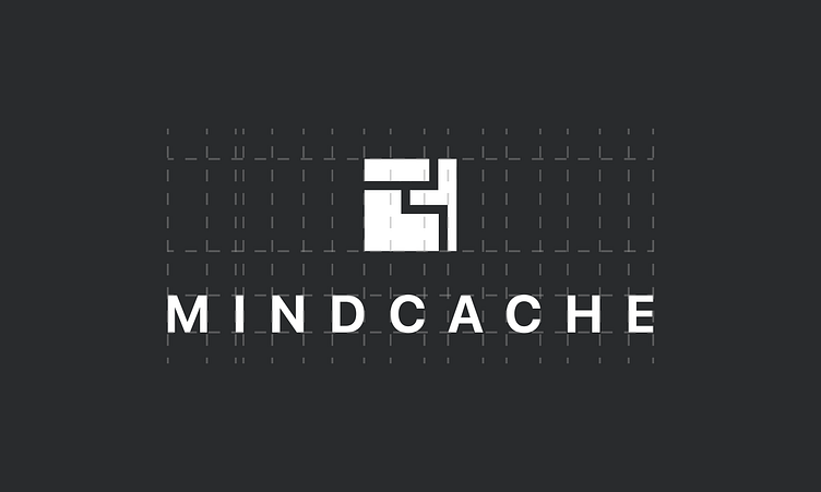
The process of creating an icon for a brand such as Mindcache can be quite challenging, as it needs to work with a logotype, fit in a favicon, and be minimalistic all at the same time. I decided to use an abstract, rectangular puzzle icon to represent growth, problem solving, and complexity.
The icon's negative space also represents pathways, or creating connections between different concepts.
I had a few attempts that were unsuccessful, mostly because they made the icon look too busy. After a lot of experimentation, I landed on this simple, 3-piece design that I am happy with.
The Logotype
The logotype text is very simplistic, it is SF Pro Display which is the system font for all Apple devices) because it is clean, yet professional and versatile typeface. The tracking on the type is also very high at 430, which gives a clean, premium look.
Color Choice
I chose the primary sunset pink color to represent Mindcache as it represents boldness, creativity, and passion. It also makes the brand quite recognizable, being that there aren't many other brands that use this colorway.
Mockups
Here are some hypothetical UI mockups to showcase how the logo could be used in the real world.
Huge thanks to Anthony Boyd Graphics for the Apple device mockups.


