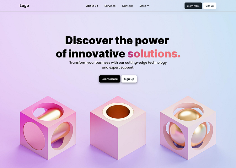
UI Hero Section with 3D Elements
I made two versions, which one do you like the most?
I liked the thought of 3D in the last post so I had to do something again. This simplistic hero section invites viewers to delve into a world of cutting-edge solutions. The 3D spheres in a cosmic-hued backdrop creates a sense of dynamic and limitless possibility. This design blends sleek visuals with impactful messaging, promising a transformative journey for any brand seeking to propel itself into the future.
What I'm curious about:
How would you fine-tune the design for your specific brand or project?
What feedback do you have on the color palette, typography, and/or design of it all?
Share your thoughts and make this even better.
More by Isa Djan Hindic View profile
Like

