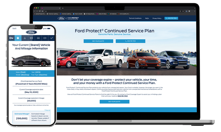
Ford Protect User Flow
Introduction
The Ford Protect Customer Insurance Quote Flow Redesign project aimed to enhance the user experience and visual appeal of Ford Protect's insurance quoting process. Collaborating with a cross-functional team, as one of the UX/UI designers, I utilized Adobe XD, Adobe Photoshop, and Adobe Illustrator to craft an intuitive and visually engaging interface. The primary goal was to streamline the customer journey, making the insurance quoting process seamless and user-friendly.
Main Objectives
Enhanced User Experience:
Reimagine the existing insurance quote flow to optimize usability and simplify the overall customer journey.
Visual Cohesion:
Establish a cohesive visual language across all screens, ensuring consistency in design elements, color schemes, and typography for a unified brand identity.
Efficient Navigation:
Improve navigation within the quote flow to minimize user friction and enhance accessibility, providing a smooth transition from one step to the next.
Responsive Design:
Ensure a seamless user experience across various devices and screen sizes by implementing responsive design principles.
Key Achievements
Through thoughtful redesign and improved navigation, the team achieved a notable reduction in the average time it takes for users to complete the insurance quote process.
Successfully implemented a cohesive visual language across all screens, ensuring consistent branding elements, color schemes, and typography.
Conducted usability testing and gathered feedback from real users during and after the redesign process.


