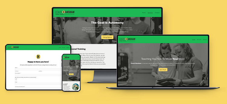
Coach Hanshaw Branding and Web Design
Coach Hanshaw was looking to hone her personal training to enhance her business' presentation. We wanted to focus on the fact that she was a woman-owned business that focused on her clients autonomy and creating a program that was as individual as her clients.
Logo Design
Creating logo with both bright colors and bold font represents how she approaches training with structure pops of light-heartedness. With green and yellow being such energizing colors, pairing them with the stability of black creates a great contrast. We also wanted to pair a slender and bold version of a typeface; symbolic of progression and emphasizing the coach herself.
For the icon, I thought the subtlety of the way an 'H' has a similar shape to a dumbbell fit with Coach Hanshaw's emphasis on not being your stereotypical gym coach.
Print & social media
To complete the brand, social media templates for Instagram stories and posts were created. Backing your brand through social media helps people remember your brand as well as want to view the information being given.
To reinforce her brand, logos and colors as well as fonts are utilized in her screening and waivers. Her icon proved to by a very fun background and pattern for flyers and posts.
To view Coach Hanshaw's website or contact her about her services, go to: https://www.coachhanshaw.com/


