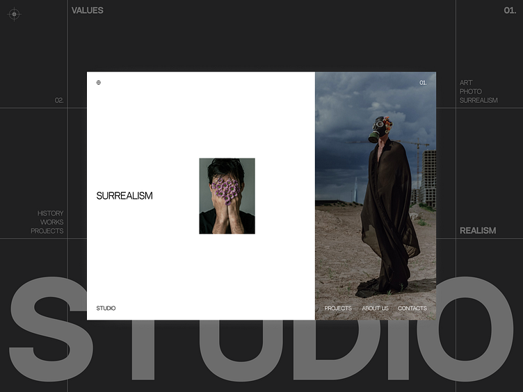
Photography Studio Landing Page
Hey, pals! Have a look at our Photography Studio Landing Page design ✨
📷 In this photography studio landing page, we mostly focus on animation.
👉 The shot displays the main screen with sections and colorful photos.
🎨 To create a neutral color palette, we used black and white 🐼 that keep users’ attention focused on the photos. The red 🍎 elements make an eye-catching addition to the composition.
The landing is special for its emphasis on the photos and a simple minimalist design🔥
Press 💜 if you like our design and share feedback!
Interface by Sonya Baikova
More by Desire Creative Agency View profile
Like


