Ramos redesign. Not 'Awesome' feedback
⚠️ I don't want to offend anyone. I just want the feedback in the design community to be broader and more honest, not just "Awesome", let's make design better, together. I remind you that design is not an image, it's a solution to a problem.
All thoughts are subjective and subject to criticism!
Let's get started!
I saw this design on dribbble in the "Popular" section and I was very confused by it. I was also confused by the sheer number of positive reviews.
I only took two screen designs, I reckon they will be enough
to convince me to use the service! 👀
📊 For business intelligence, colours need to be chosen very carefully. In such sites there is a continuous connection between colour and associations.
For example, red, orange, yellow - warning, danger; green - success, balance, growth, etc. Therefore, orange as an accent colour may be suitable for a landing page, but its use in charts can be confusing.
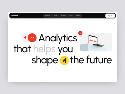
I don't know why the menu items are in a separate section, but okay. Overall it looks good, except for the sign up button, I'm not sure people will click on it right away on the first screen, better to put a login link here in the style of the other links and add a 'try for free' button or something like that.
First screen
There are a lot of problems here :(
I'll just highlight one, which concerns the word 'help'. The translucent colour gives the impression that the product is unreliable, that the service is half-hearted. The second problem is the contrast, the grey is too light, according to Analyse Luminosity the contrast ratio is only 1:1.61 instead of 1:3.
Second Screen
Let's not dwell on weird indents and alignment here. I'm not talking about the most active 'Setting up reports' element, which is rather decorative but draws the most attention. Let's talk about features.
☝️ The main functions of business analytics are: integration, visualisation, transformation and reporting. In general Ramos wrote about them, but didn't show them!
👉 White section talks about quick access to analytics and digitalization i.e. integration. Ok, but the picture does not complement the text, it has only a small piece of incomprehensible data. Let's see how integration is displayed by other services.
Bored? Oh, yeah, it's data baby 😎
👉 We jump 2 features (visualisation and transformation) and immediately show reports - black section, ok, maybe these are the coolest features of Ramos. And here's how similar functions are shown in the leaders of business intelligence tools.
🧐 I guess what you're saying is that it's too complicated and modern platforms should be simplified. But the top three target audiences for these services include data analysts, IT specialists and marketers who are used to working with charts and graphs.
"Up to 45%" is better accompanied by data, e.g. - "based on 600 companies". This shows that the data is not taken from the air.
🫵 Who's right?
Conclusion:
Yes, of course this is not a working site, just a concept, but I would like to see a deeper, expanded story about working on such an interesting topic as analytics. Not just a nice animation with random elements....
🤌 Leave Feedback Please!
Tell me how you like the work I've done and would you like to see more of this kind of feedback?
Good luck! See you on Friday!
⚡️Thanks Lindsay for design dashboard ❤️
☝️Illustrations taken from Looker Studio for illustrative purposes only


