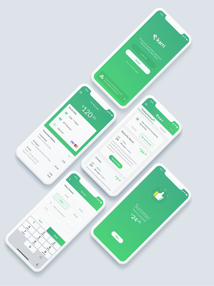
Karri Mobile App
Working in the school and family space we wanted to keep the UI light-hearted. The simple use of white with the primary brand colour gave us the opportunity to incorporate spot illustrations as an element of design.
The Karri app posed various intricate challenges, spanning from onboarding intricacies to shared account scenarios. Through collaborative workshops between Isoflow and the Karri team, innovative solutions were crafted, simplifying complex problems into efficient designs. Developing interactive low-fidelity prototypes facilitated the effective communication of these UX solutions to the UI design team.
A set of lively, contemporary shades of green were chosen, inspired by Karri's goal to moderise and revitalise traditional payment methods. Symbolising swift and seamless transactions, Karri's emblem depicts a stylised credit card, effectively serving as both a logo mark and an app icon.
See the full case study


