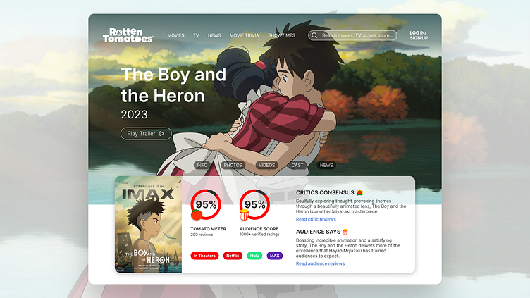
Rotten Tomatoes: webpage redesign challenge
Hero Section
Consolidating essential information into one easily accessible section allows users to conveniently access comprehensive information about the movie without navigating through multiple fragmented sections.
I also added a secondary nav to increase accessibility to the page without overwhelming the user with options.
Redesigning Reviews
The reviews section was in need of a visual refresh, along with a more consolidated approach to organizing critic and audience reviews.
Visual & Informational Hierarchy
Restructured and condensed information into bite-sized components, alleviating information overload. Revised visual hierarchy based on user relevance and importance, prioritizing content aligned with user goals by elevating it to the top of the page.
More by Caroline Millet View profile
Like


