Dispatch Board Redesign
Streamlined Dispatch Board Redesign
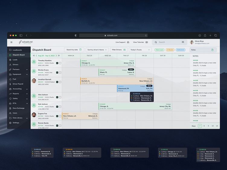
Excited to unveil the redesigned dispatch board for EZ Loads!
What’s New:
Enhanced Readability: Shifted from a dense, grid-based layout to a cleaner interface, improving legibility and reducing cognitive load.
Intuitive Navigation: Simplified menu and filter options offer a more intuitive user experience, enabling quicker access to crucial information.
Visual Hierarchy: Employed a stronger visual hierarchy to emphasize critical data points, like delivery locations and times.
Color Coding: Integrated a strategic color palette to differentiate between driver statuses, load types, and action items, aiding in immediate recognition.
Responsive Design: Refined for cross-platform use, ensuring seamless access from desktop to mobile.
Driver Focus: Driver information is now front and center, with quick-view contact and vehicle details for efficient communication.
Challenges Addressed:
Cluttered Interface: The original board was information-heavy. The redesign declutters the interface, presenting only the most pertinent data.
Workflow Efficiency: Recognizing the need for speed in dispatch decisions, the new design accelerates load assignment and tracking.
User Feedback: Incorporated feedback from real-world users, focusing on pain points like note-taking and status updates.
By reimagining the dispatch board, we’ve created a tool that not only looks better but makes the dispatch process more fluid, efficient, and user-friendly. Take a look at the before and after, and let us know your thoughts!
