Finding Your Roots: The Design of Ivy Notes
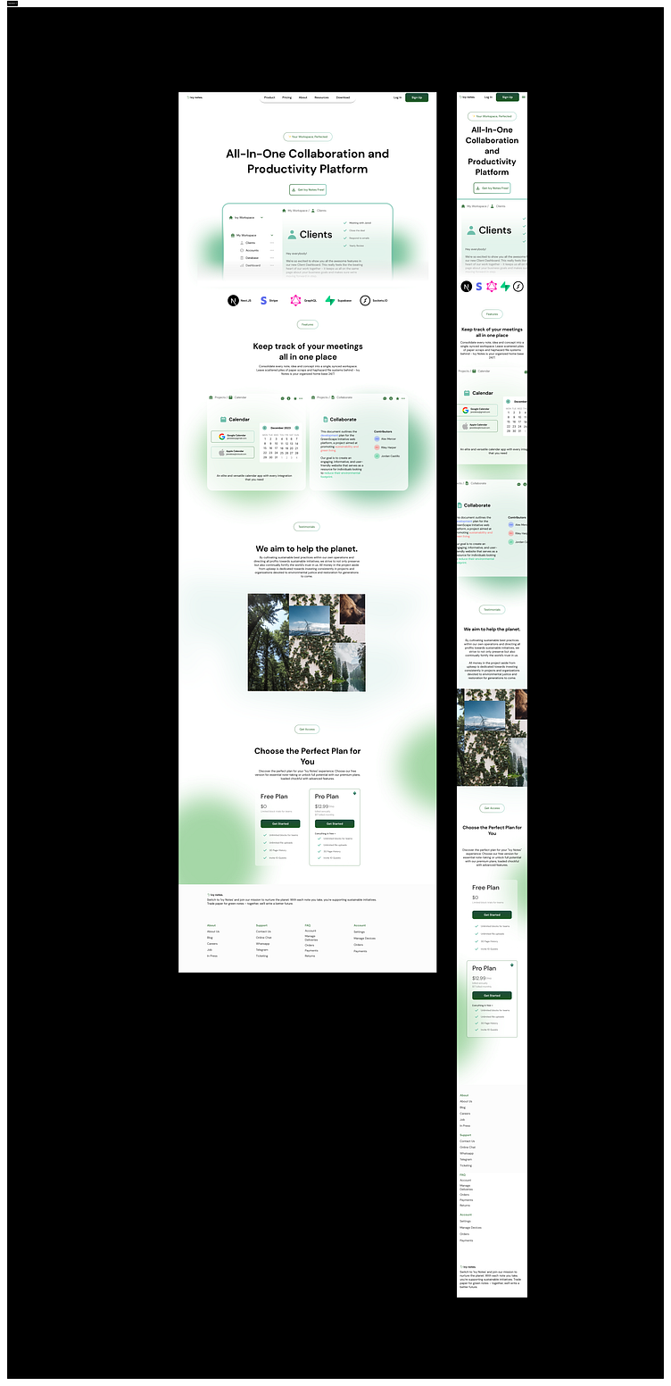
Ivy Notes aims to be your go-to app for jotting down eco-friendly ideas and tracking your impact on the planet. In designing it, I wanted the experience to feel as natural and nourishing as the causes it supports.
Nature served as my muse - from the organic color palette and textures, to custom components that bloom across the interface. Skeuomorphism played a role as well, with botanical elements like leaves and vines adding a sense of the earthy. At the same time, a glassmorphic overlay gives the experience a refined, contemporary edge that won't fully immerse users in an outdated aesthetic.
Bringing the hues of a lush green habitat, I landed on a moss-tone theme with accents of sky and sea.
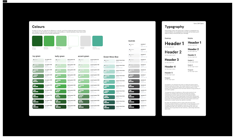
Nurturing Nature’s Palette
Creating a palette aligned with Ivy Notes’ mission began by observing the varying hues found throughout the natural world. Mossy greens become the foundation, envisioning users feeling comfortably surrounded by verdant shades as they cultivate eco-conscious habits.
A Song of Fonts
Pairing with this textured background, DM Sans strikes the perfect balance. Its rounded terminals and sturdy structure feel friendly yet enduring - like the very trees users help by applying sustainable practices in their notes.