Design System Starter Kit

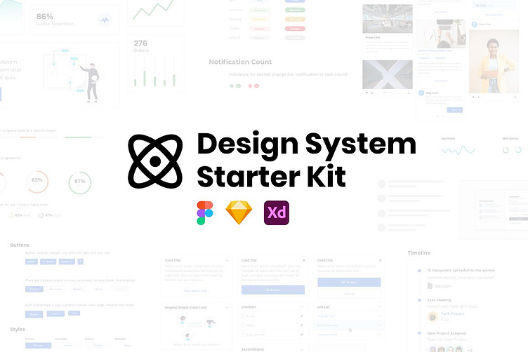
The Design System Starter Kit is made for Figma, Sketch, and Xd (code version coming in HTML/CSS, Angular, React, and Vue). Built to save you weeks (or months) of design effort. this kit will set you up on the right foot to build the design system you’ve always needed but never had the time to make.
The perfect kickstart template for SaaS-focused digital products and brands. Accelerate any project by quickly and easily applying your styles to these atomic components and layouts.
The templates are the core groundwork for a robust branded product experience to accelerate any company's deliverables and quality. Imagine instead of a checklist you have a design file primed with everything you need to get started. All you need to do is edit colors, fonts, and styles and you’re off. WEEKs of design work done for you.
A great timesaver that is perfect for building client or in-house design systems from scratch.
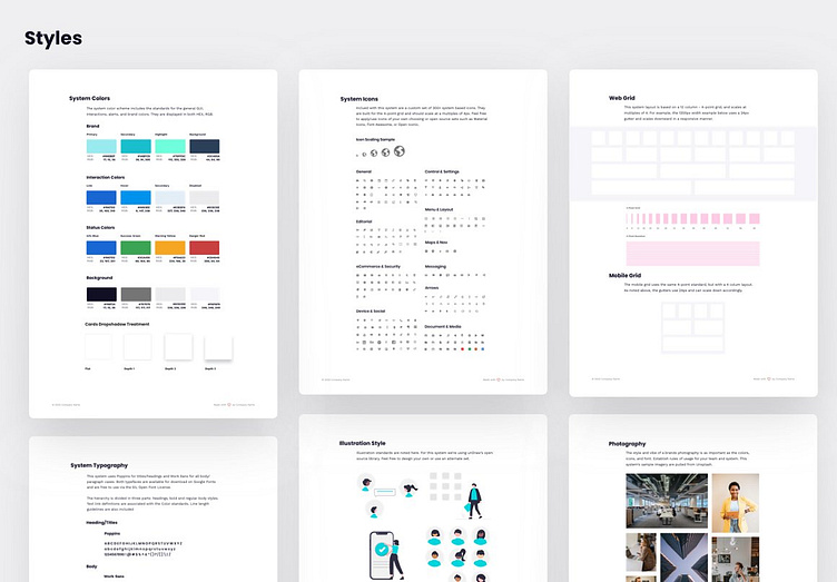
So, you’ve got your style guide… or maybe you don’t even have that. Not to fear, the main differentiator with this kit is that the initial styles are all best practices (ADA accessibility @ AA/AAA) and are aligned above the atomic components, so you can easily add or tweak them as you go!
This is not a typical UI kit. Most pre-made component kits are often a pain to work with after a few changes and rarely fit your desired end state seamlessly.
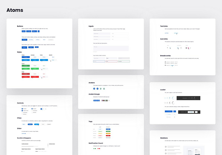
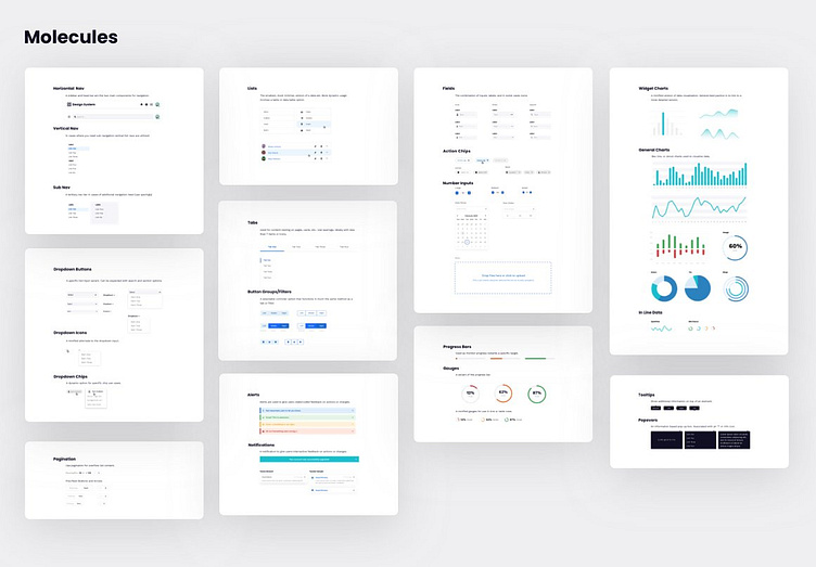
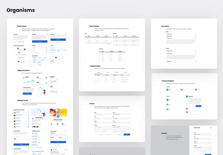
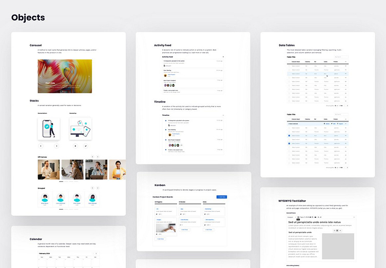
Why apply something that won’t scale with you? We take atomic design elements and apply best practices to them out of the gate. With 20+ atoms elements, 20+ molecule elements, 10+ Organism Elements, and 10+ Objects you’re instantly ahead of the game. Apply these elements with ease to the 30+ layout options (both web and mobile) using a scalable 4px grid system.