Day 25
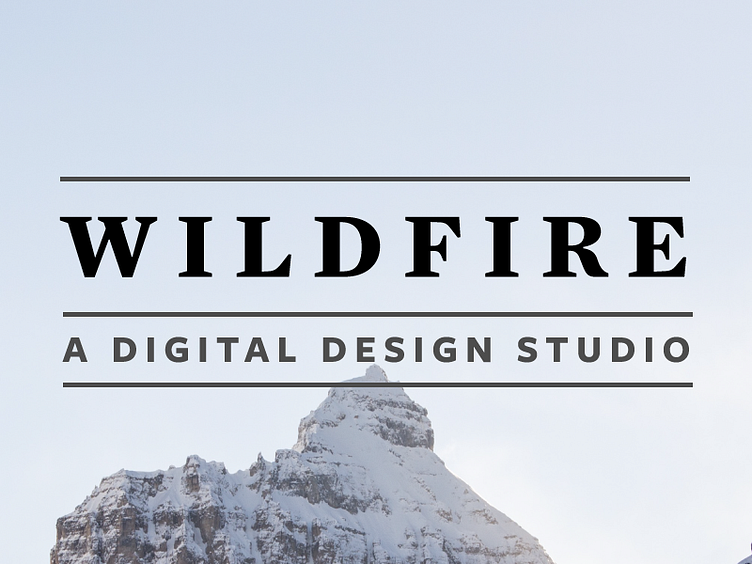
This is Day Twenty-Five of Thirty Days of Logos, in which I share a new logo idea for my design studio, Wildfire Studios, every day for 30 days.
After finally nailing down what I believe will end up being my symbolic lettermark/logo in Day 24, I have started putting together some basic ideas for a wordmark. This is one that's stuck with me now for about a month, inspired by some other branding I saw locally: all caps, mixing serif and sans serif, using nothing but lines and slightly shading to distinguish thoughts.
It's obviously an incredible simple design, but to be honest, I think simple is best. This is much better than the first wordmark that I put together for Day Two.
What are your thoughts on this approach?