Validation Task Hub

This was a quick project to help solve the UI and UX for this task management module (I did not design the structure). This platform relies on series of tasks that historically were housed in a series of grids and a new interface was needed to improve user experience.
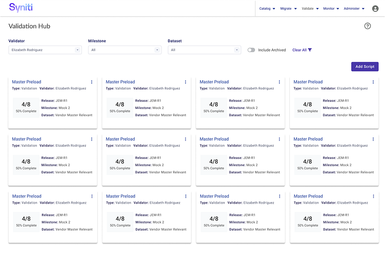
Validation Hub Lander
The cards here are obviously sample data, but at a glance the user would be able to see their task groupings, which are called scripts. The script's completeness and a few other key data points are shown on the card to provide a quick summary to the user. The filter defaults to the userID, but managers, etc., could easily change the filters to return desired results. Based on the user role, they may be able to add a script.
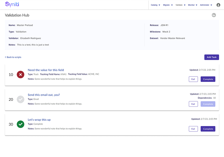
Script Detail
Once a user drills into a card from the lander, they are taken to its detail. The detail consists of a header with key metadata and its tasks. Depending on the user's security role, they can set a task status and add an additional task. Depending on the task, there may be data points collected when they select to complete the task.
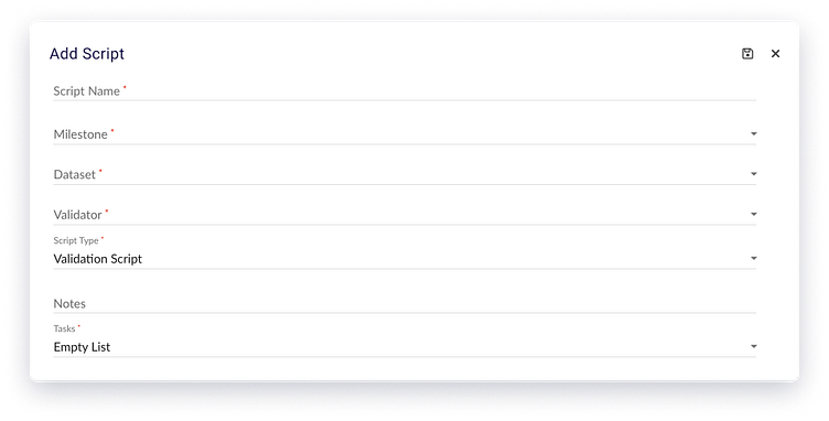
Add Script
If the user has the rights to add a script, a modal is raised to quickly insert the record to minimalize work flow interruption. Nothing much special about this modal but I included it to speak to the need for varying types of insert and update methods based on the user actions. On a side note, the save icon is a bit 1990's but was a client request. :)
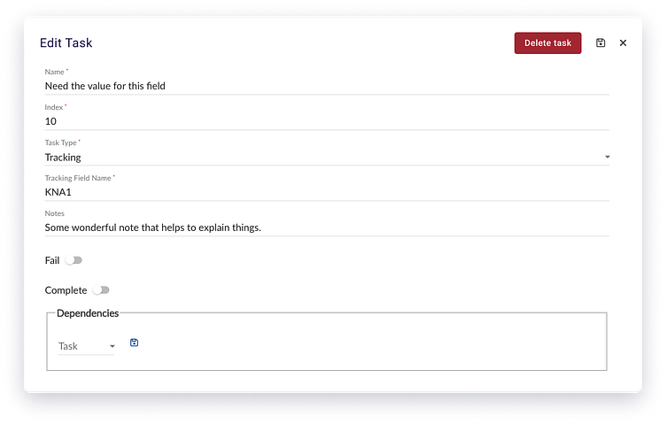
Edit Task Modal
Here again you see the use of a modal for data input. Since this application is not for mobile or tablets, we can use modals without risk of poor UX. A modal may be appropriate when you need to the user to focus on a specific task, they do not need to see the data on the main page and you want to avoid redirect. There is nothing special about this modal but that's the point, sometimes you need a simple and effective way to manage data without visual distractions.