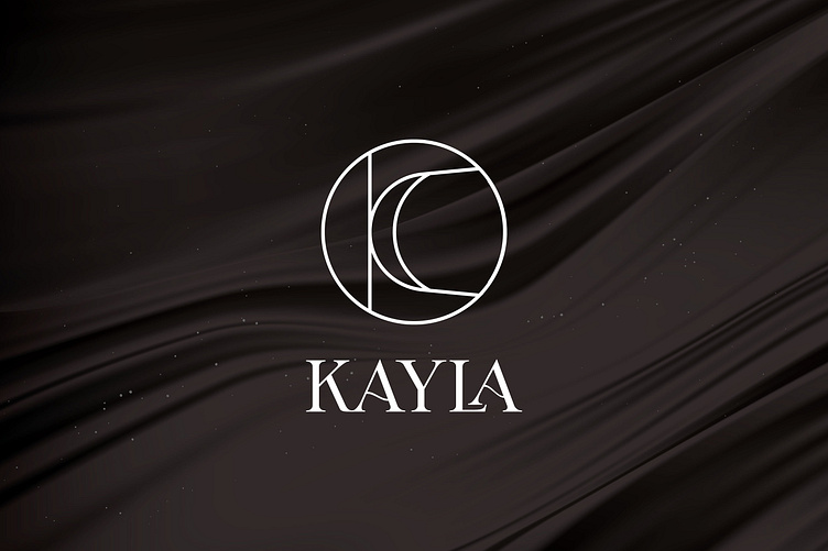
KAYLA | LOGO DESIGN & BRAND IDENTITY
The moon has always been an image representing femininity, ethereal beauty, tenderness and wistfulness. The moon is full of mystery, romance and grace like a proud, gorgeous, gentle but still strong girl.
That is the image of a modern woman that KAYLA Jewelry wants to bring to each customer. Inspired by KAYLA's impressive message, Bee Art cleverly integrated the image of the moon into the logo. Designed in the style of Minimalism, KAYLA's logo uses minimalist, harmoniously coordinated lines, forming the letter K symbol representing the brand name. Hidden in the logo are images of a full moon and a waning moon - representing 2 personalities of a modern woman: elegance, charm and strong personality.
Designed by Bee Art
-
Client KAYLA Cosmetics
Logo and Branding Project. Logo is designed for Hotpot Restaurant in Vietnam.
Copyright © Bee Art. All Right Reserved
Contact us:
• Hotline/ Zalo: (+84) 77 34567 18
• Email: info@beeart.vn
• Website: www.beeart.vn
• Facebook: https://www.facebook.com/BeeArt.vn


