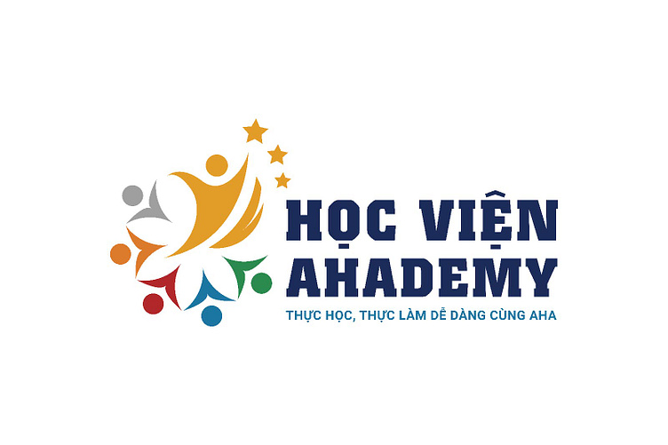
HỌC VIỆN AHADEMY | LOGO DESIGN & BRAND IDENTITY
[Logo and Branding Project] Học viện Ahademy
Kaiza has created a stylized design between the brand name and human image, bringing a feeling of cohesion and unity. The image of five people rising and connecting in a circle creates unity into a cohesive block into a learning community, giving viewers the feeling of a friendly and mutually supportive working and learning environment. The logo stylizes the largest human image and small stars representing the leader, showing development and breakthrough. The logo uses the five elements of metal, wood, water, fire, and earth to create diversity and the educational aspect of the brand. The overall impressive logo represents the importance of unity and development of individuals within a group.
Designed by Kaiza
Copyright © Kaiza. All Right Reserved
Contact us:
KAIZA CO.,LTD
• P: 0889 996 399
• E: info@kaiza.vn
• W: www.kaiza.vn


