Wireframe Examples
Using a library resource I found on the Figma community site, I expanded it to create a more complete library with components that better reflected my needs. This allows me to focus on UX and rely on the design library that the design team maintains. This also helps my stakeholders to better assess if the solution meets their needs without the distraction of fit and finish discussions.
List Page
I designed administration a few years ago and the pattern is pretty simple. It has a basic vertical menu, a list page which consists of a grid, a record detail that a user can drill into and an create/edit form. This is an example of this simple list page.

Detail - Direct Update
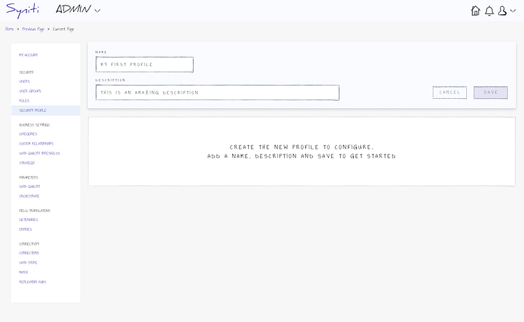
For this page, a new pattern was requested to not use the standard create/update form but to rather use a direct update to avoid user redirect. For this particular scenario it was requested that the detail have 2 tabs to display and manage different aspects. To avoid some of the complications and annoyances surrounding explicit saves on forms with tabs, I elected to have the user stub a record with just the name and description.
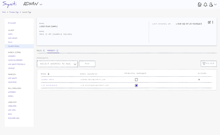
Record Configuration
Once the user saves the record, you can see that the header is in a display state. This example shows a record that has already been configured. When the user performs an update to the metadata, it is saved without the need for an explicit save, which allows for a more fluid user experience.
This page has 2 grids which have a 1 to many relationship.
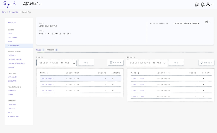
Record Configuration, Cont'd
This page is simpler than the previous with a singular grid. Part of the rational of stubbing the record with the header and then writing direct updates is that it can be a bit clumsy for the user to update on one tab, save and proceed to the next tab, save. You could potentially store the unsaved data in a staging table but you start to create more problems to maintain.