Travel Agency - Hero Section
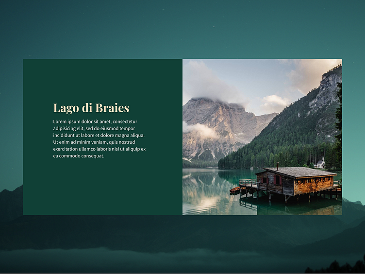
The layout is a split-screen design with a text block on the left and a captivating image on the right. This is an effective composition that balances information with visual appeal. The text block is well-positioned to draw attention immediately, which is good for conveying key information.
Color Scheme
The natural tones of the photo on the right complement the background color, creating a harmonious visual flow.
More by Martin View profile
Like
