Lassie
Today, I'll walk you through my redesign of Lassie's landing page hero
section. 🖼
About the company: Lassie is a digital pet insurance that helps you care for your dog or cat, both proactively and after unexpected
mishaps. 🐾 (Source: Lassie's website)
Problem statement
Emotional design uses colours and imagery to evoke user emotions, creating comfort and fostering meaningful connections. 🌈 While cats and dogs naturally bring joy, the current design falls short of capturing
these emotions. From font to colour palette, imagery, and copy, there's a gap in resonating with the desired emotional tone.
Although the hero section aims for trust and reliability, as evidenced by Trustpilot
ratings and statements like 'insured over 60,000 animals,' there's an exciting opportunity to enhance the emotional connection and further attract, engage, and convert visitors.
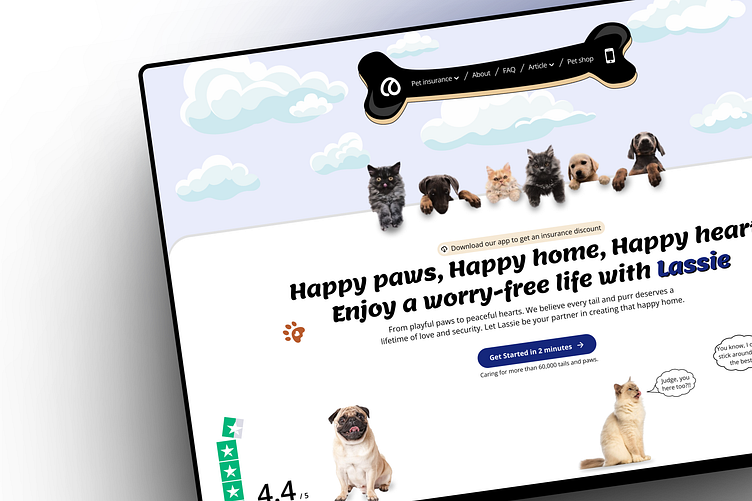
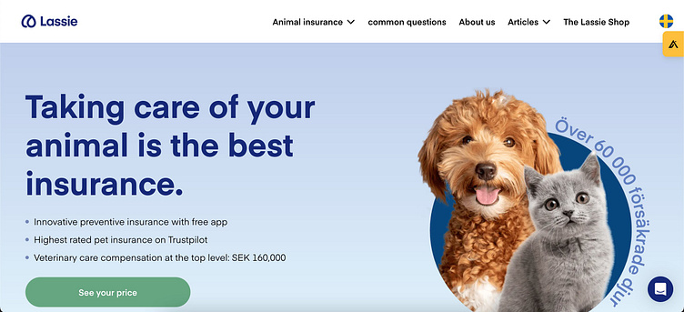
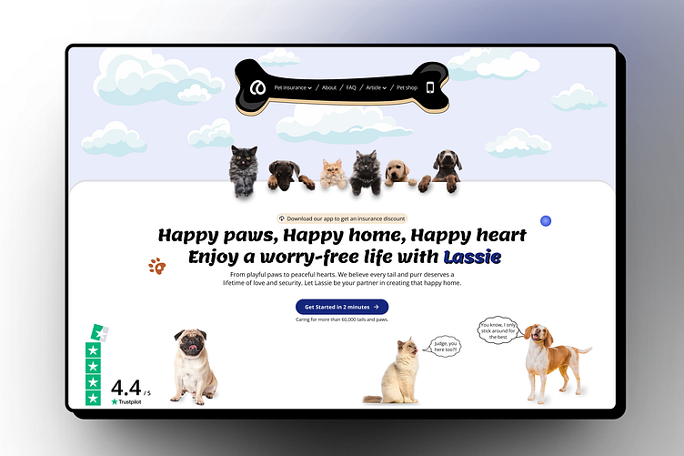
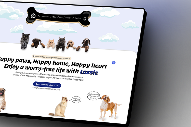
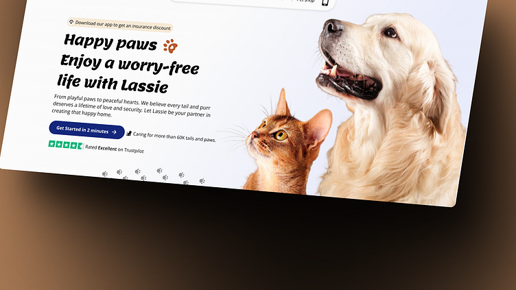
Their current design 👇🏽
Proposed Solutions
1) Typography and Imagery: Finding the perfect font that resonated with my vision took time. Ultimately, I chose "Lemon," a bold display type with a friendly and playful touch. 🍋 Finding the right images proved even more challenging, but it was well worth the effort.
2) The Copy: The original copy, "Taking care of your animal is the best insurance," felt generic and lacked brand-specific personality. To address this, I replaced it with "Happy paws, happy home, happy heart—Enjoy a worry-free life with Lassie." This more welcoming and brand-oriented copy is accompanied by a subcopy for further engagement.
3) Colour: Blue, Lassie's brand colour, should be used for key actions on the interface, such as CTA buttons, to facilitate brand association. However, the current design uses green. While the reason for this is unclear, I opted for blue, complemented by brown as an accent color. Brown, after all, is a familiar hue in our furry friends' world. 🎨
My REDESIGNS:
1) Creative Outburst: A vibrant, playful concept featuring a bone-shaped illustration amidst fluffy clouds, with cats and dogs in
conversation. 🐶🐱💬

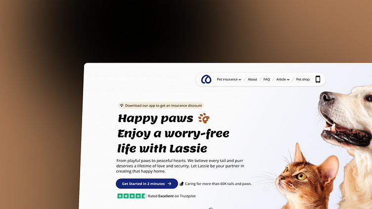
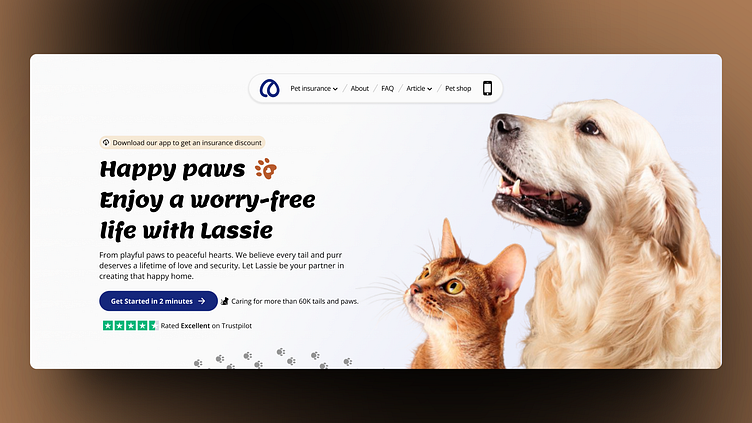
2) Simple but Effective: Embracing minimalism, a captivating image of a cat and dog anchors the section,
complemented by a floating navigation bar. 📸
I hope you found it insightful and engaging. 🚀 Please share your thoughts on my redesigns! Which one resonates with you more, and why? Your feedback is invaluable.
Press 'L' if you love it, and feel free to give me some feedback. Have a
great day!
Want to talk about a project? Feel free to contact me at:
kayodesasona100@gmail.com
Thank you for your time! Until next time, bye! 👋
