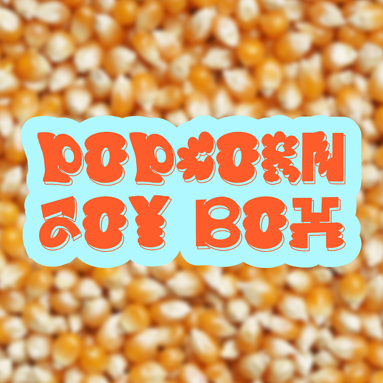
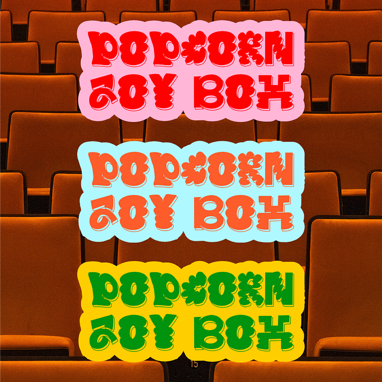
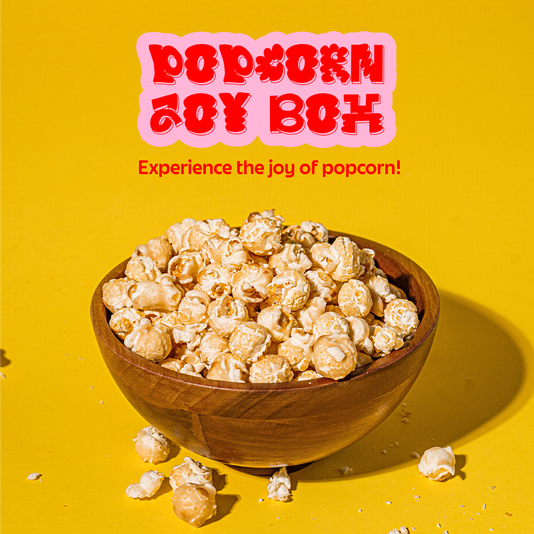
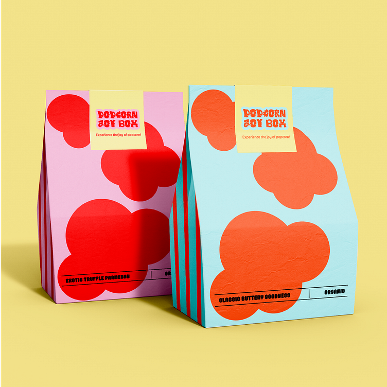
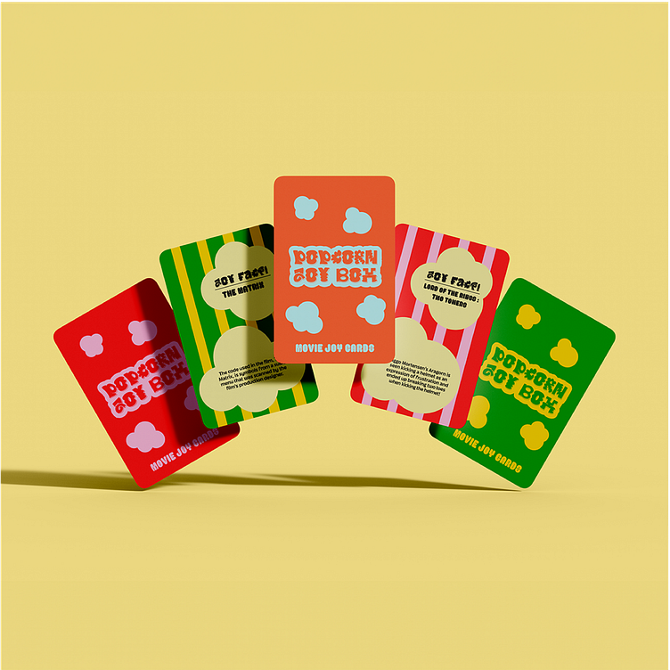
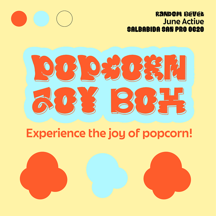
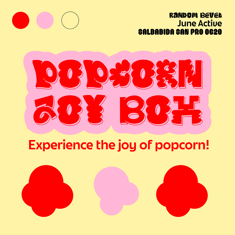
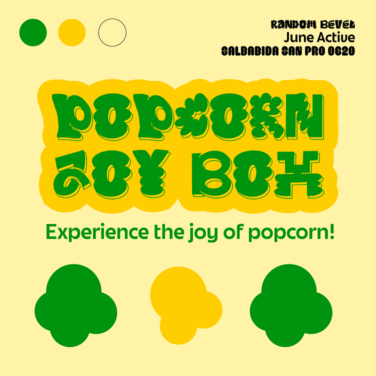
Popcorn Joy Box
For the design, I wanted to bring the joy of the brand into the logo and color palette. The logo is fun and poppy, but also references the shape of popcorn in some of the letters. The two tone color combos help signify which popcorn flavor is in the bag and refers back to the original two tone colors of red and yellow usually associated with popcorn brands.